Work/Branding · Pratt Institute
Key Food
A mid-century rebrand for a Brooklyn neighborhood grocery: a key badge, a sign-painted signage system, and a store brand rebuilt from the shelf up.
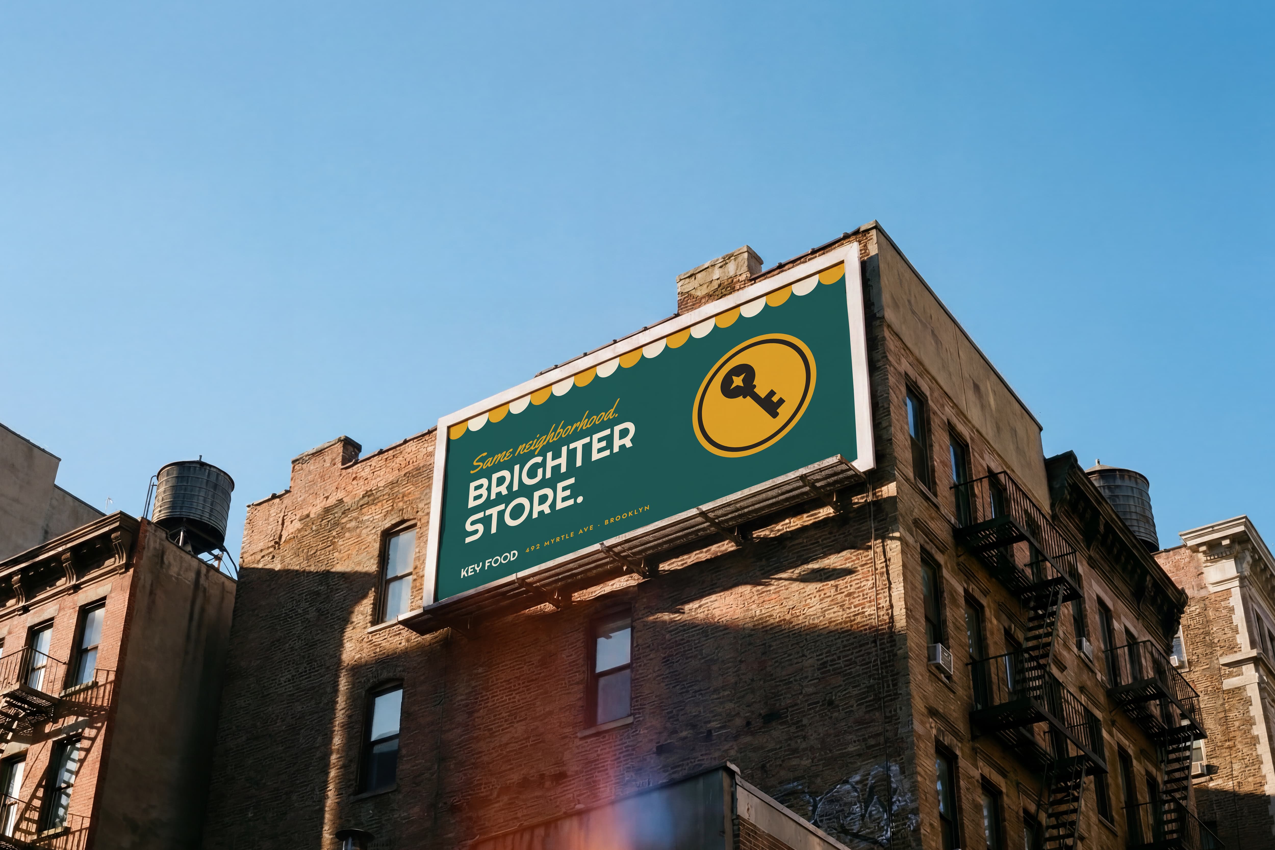
Research
Starting in the store
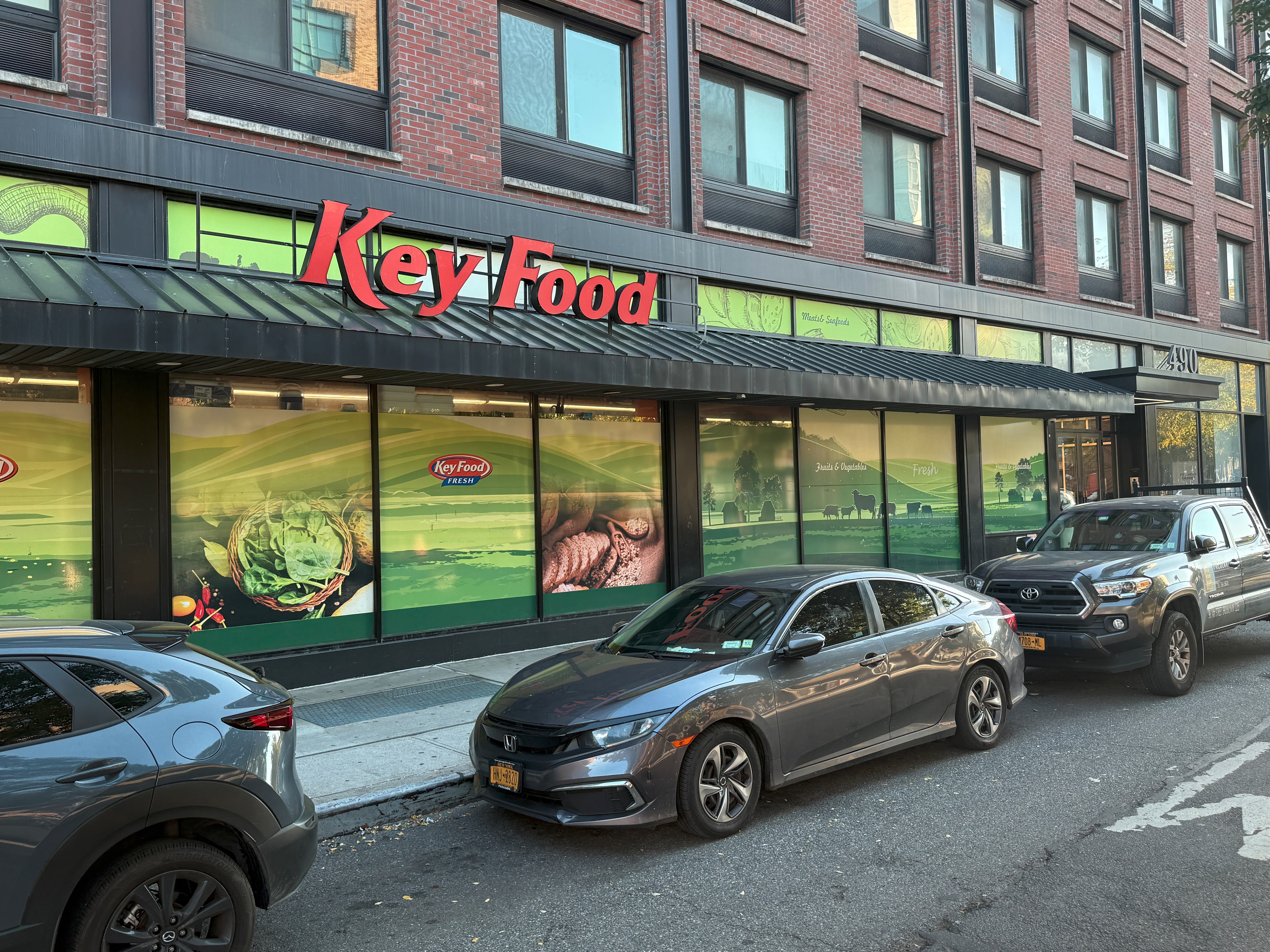
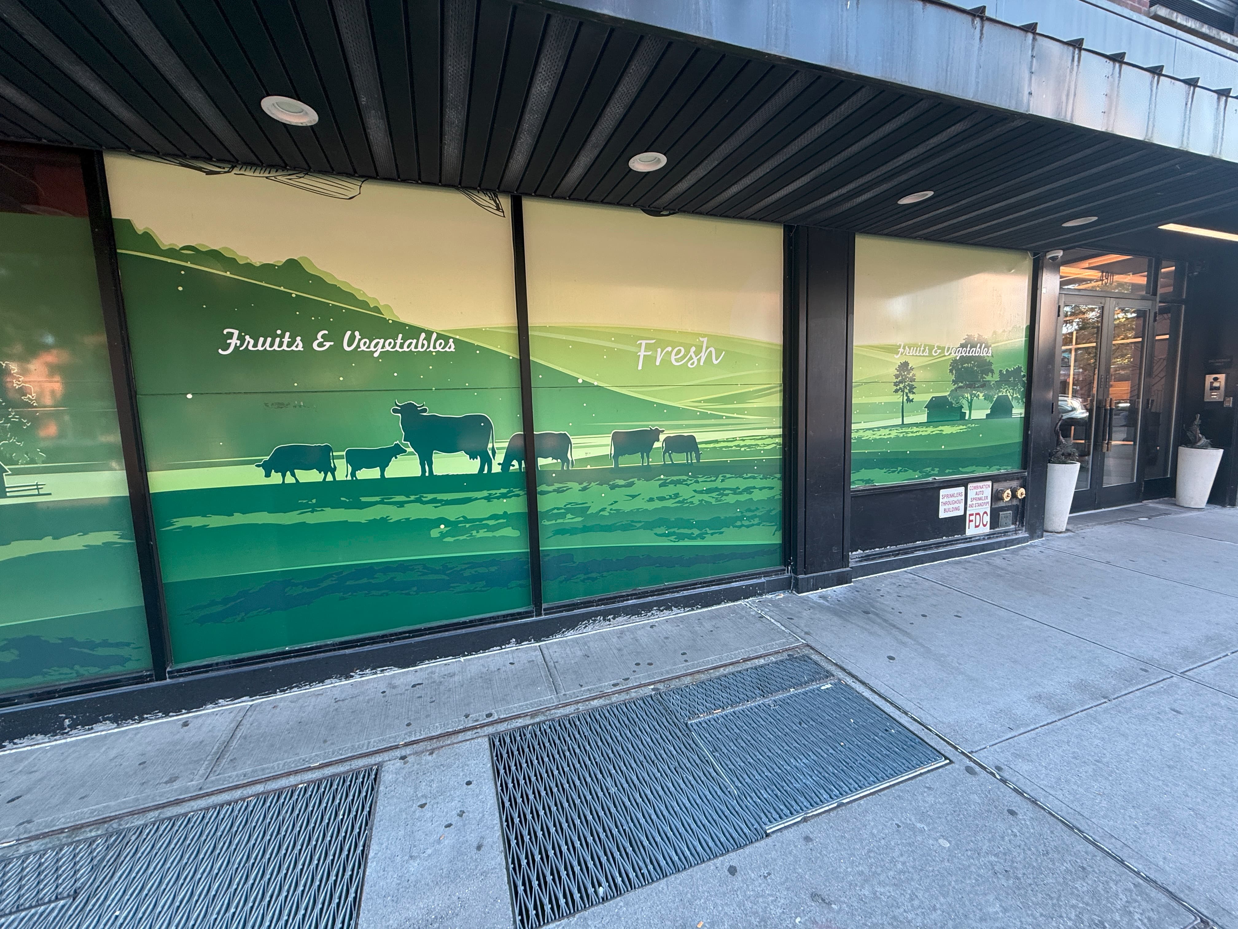
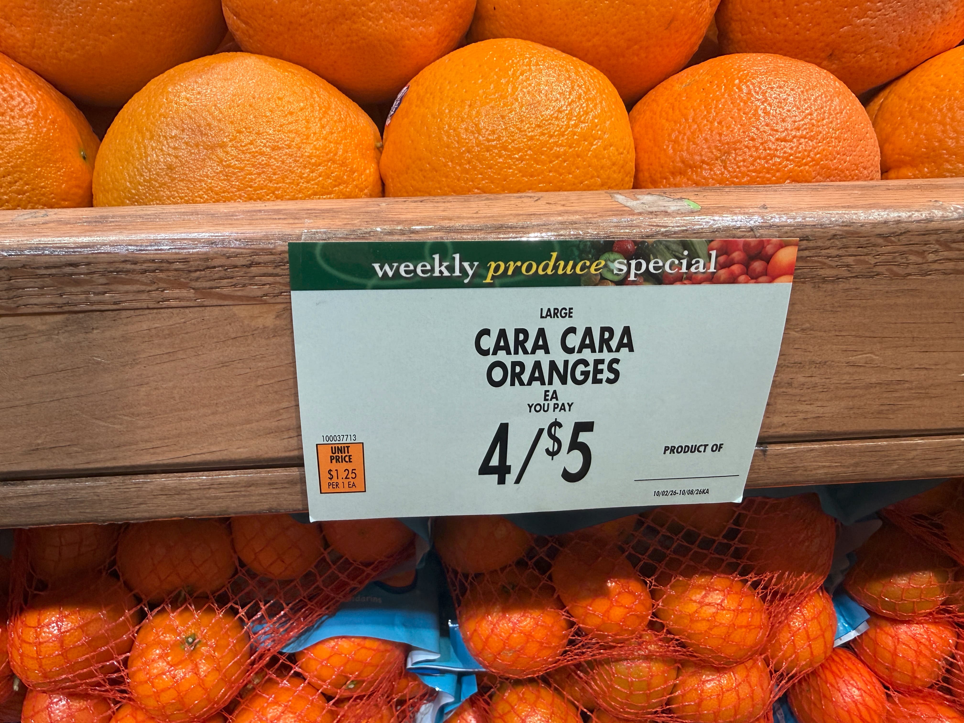
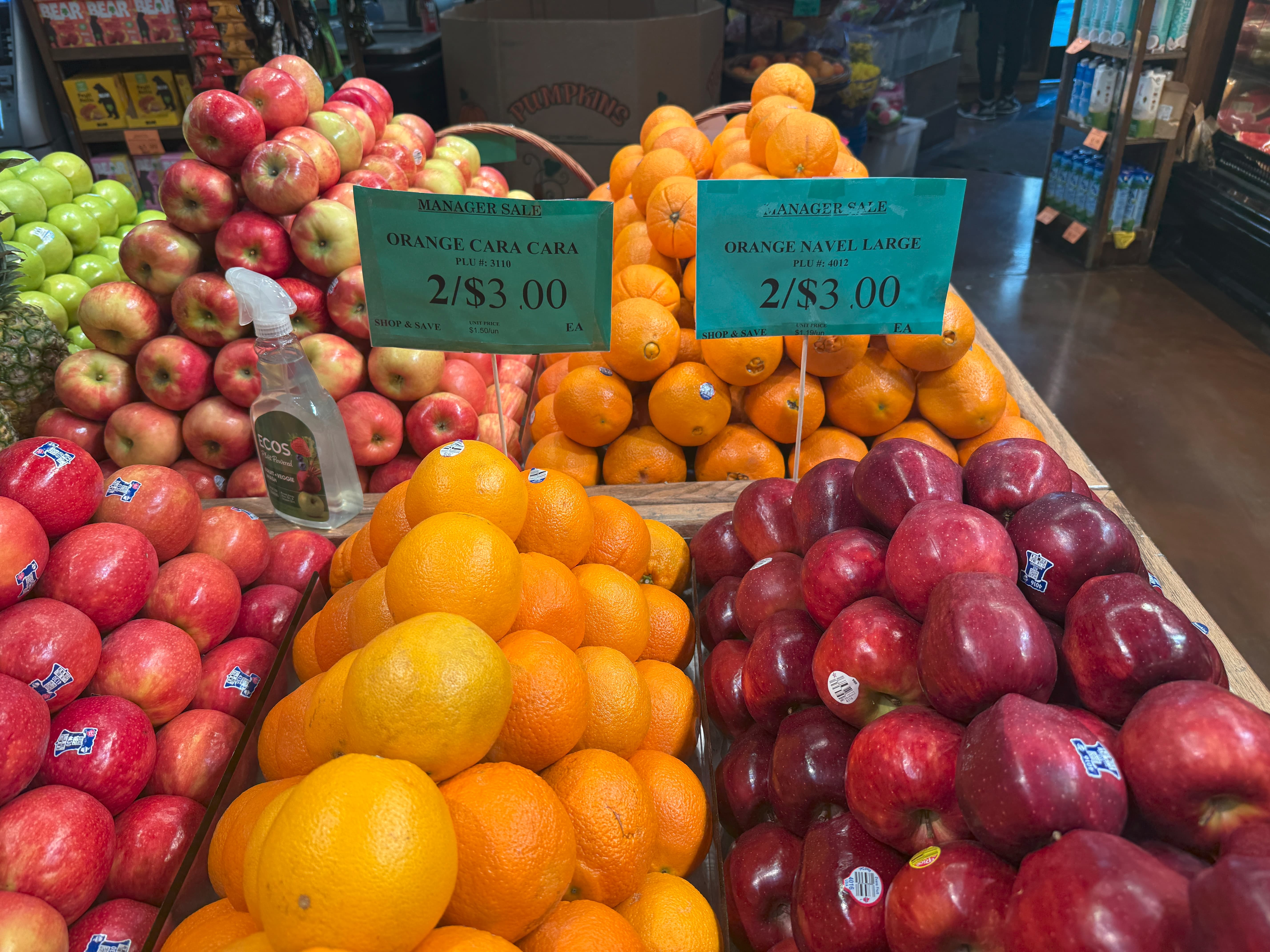
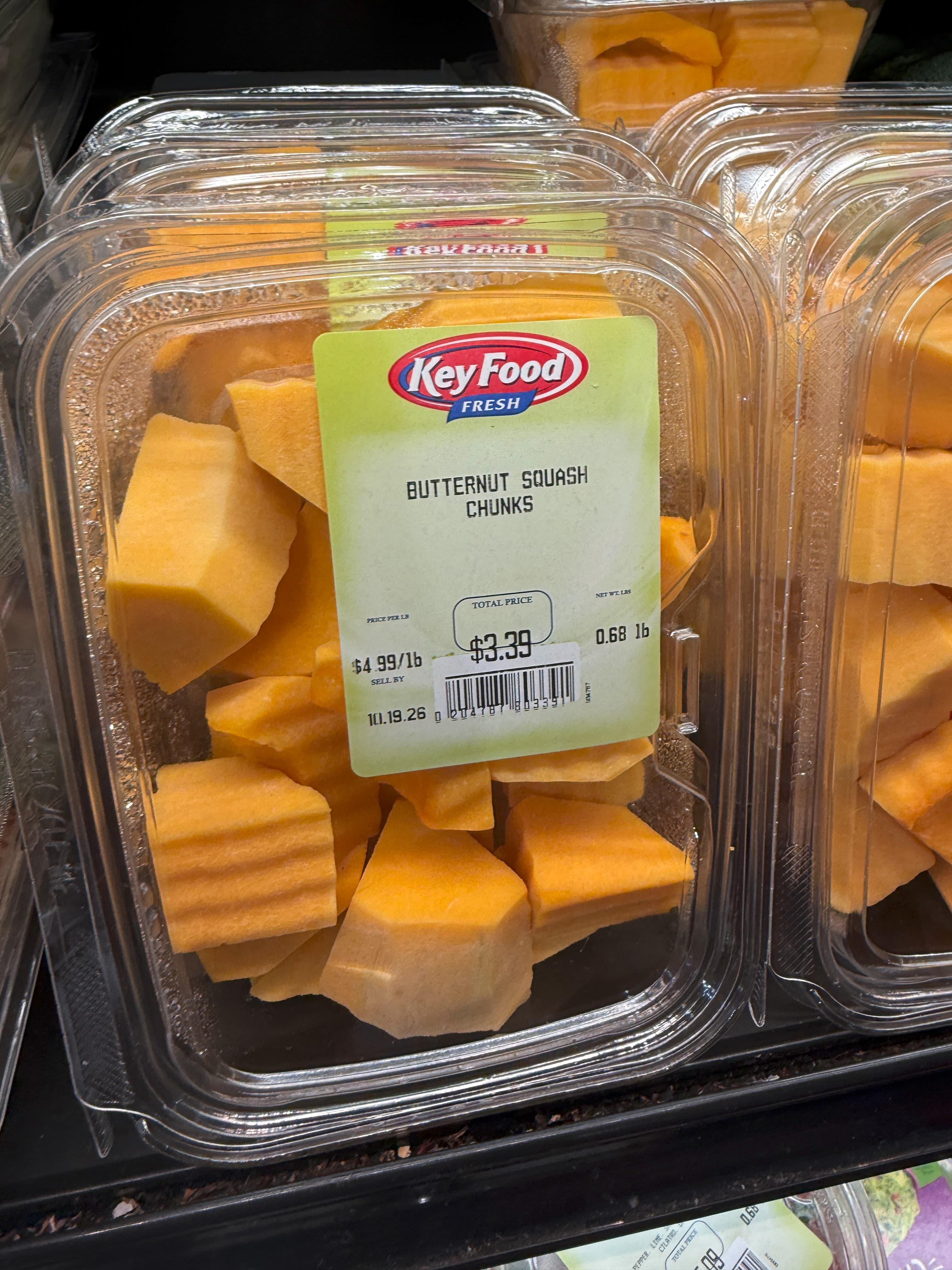
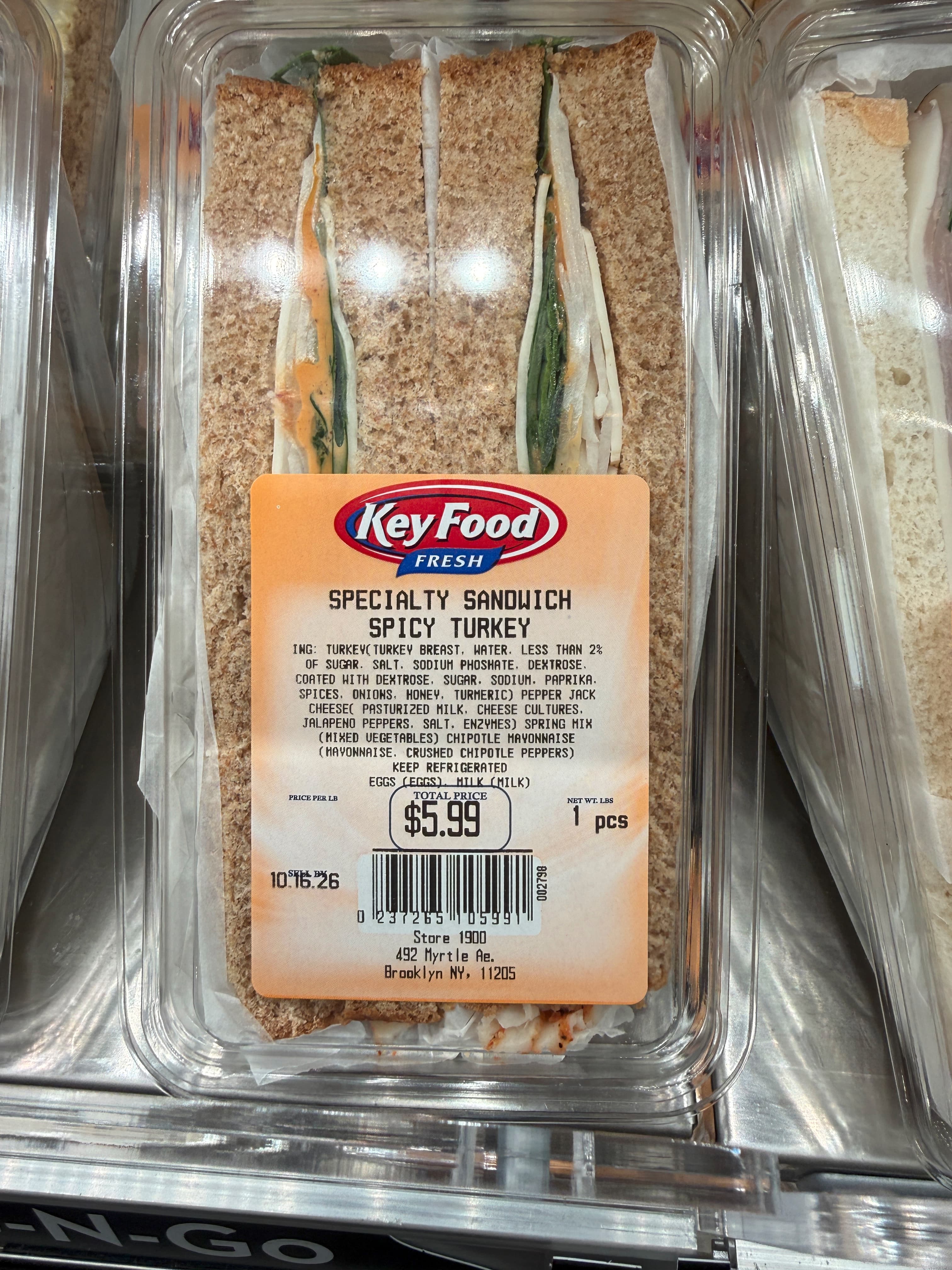
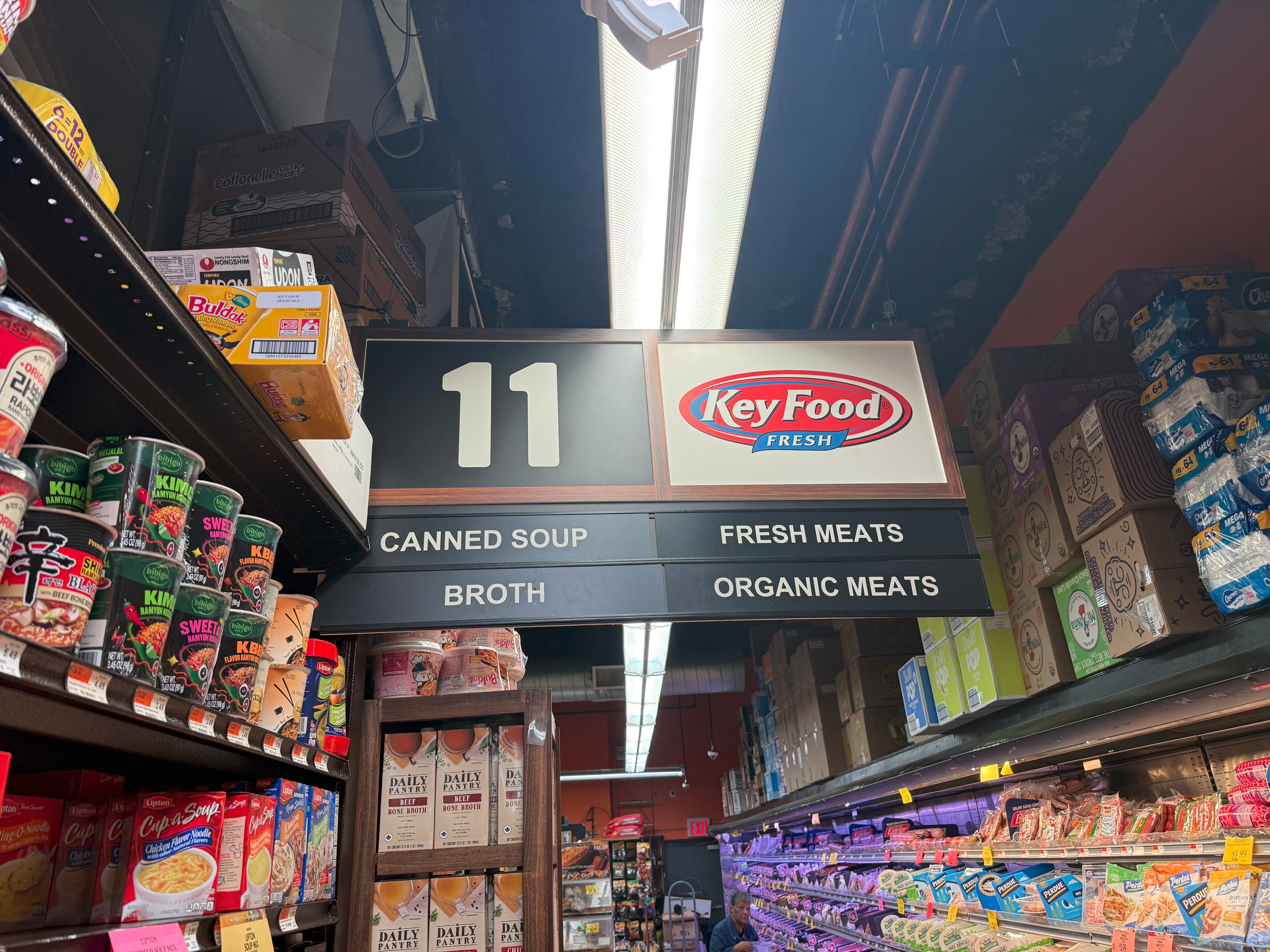
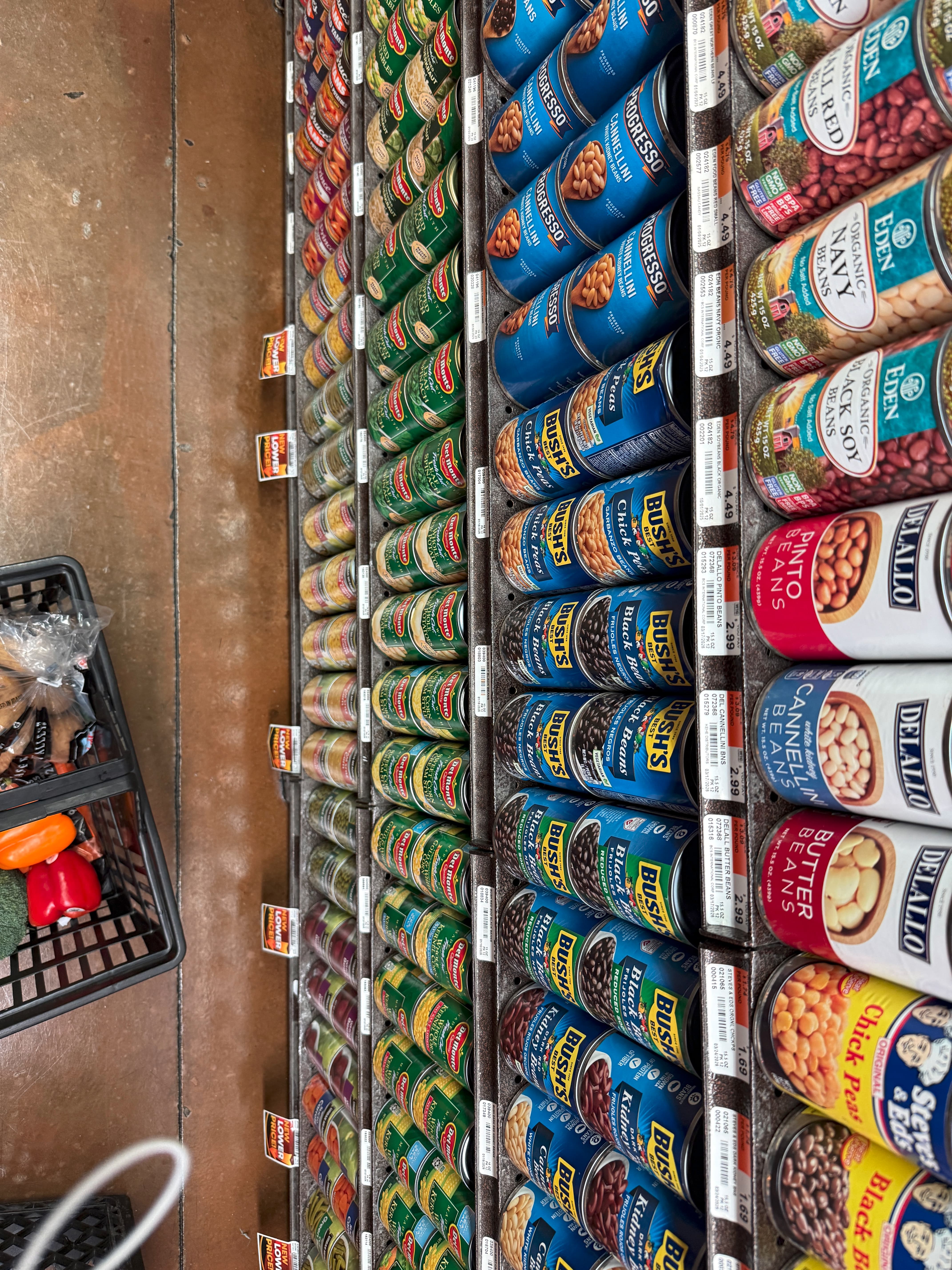
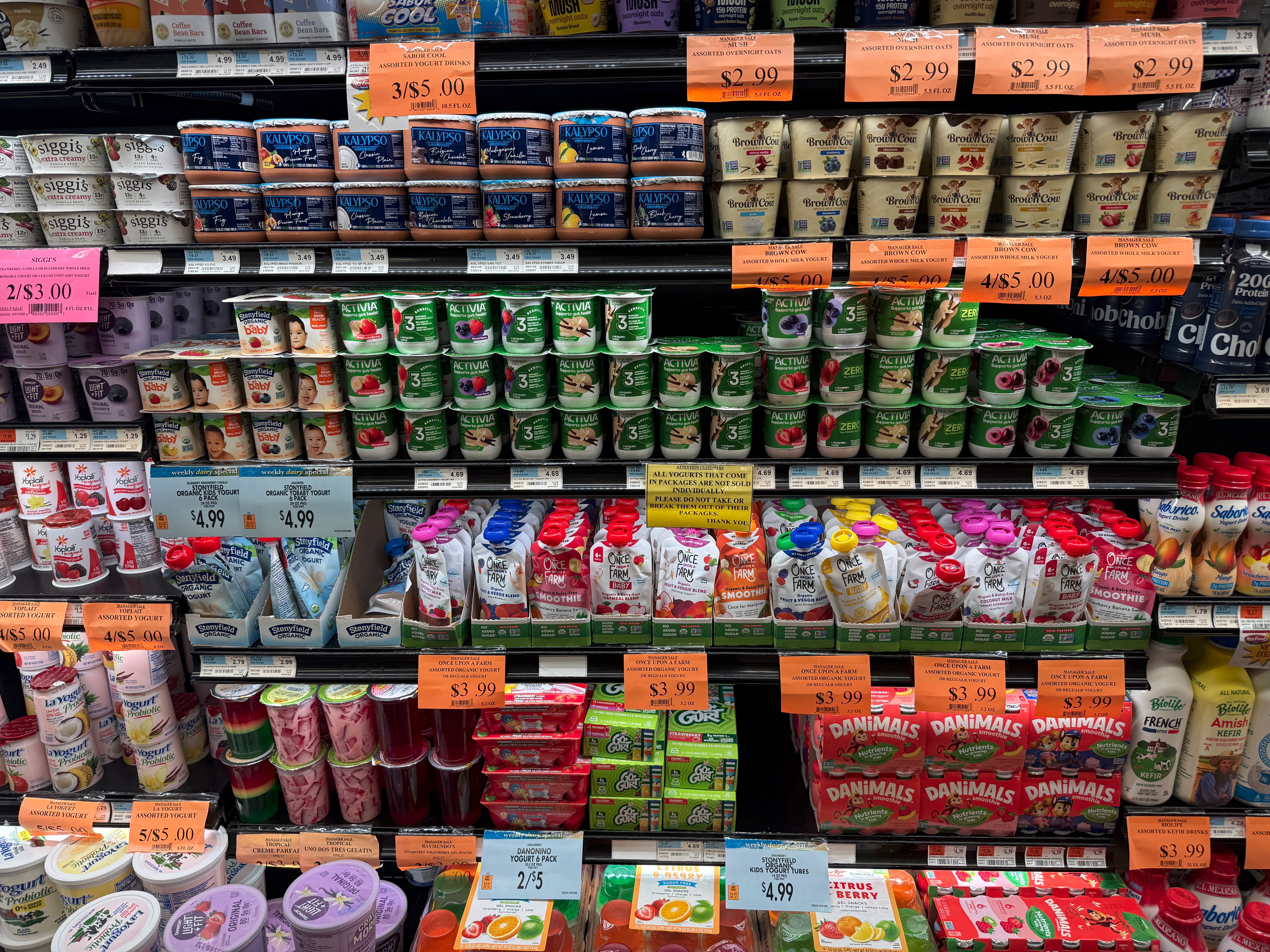
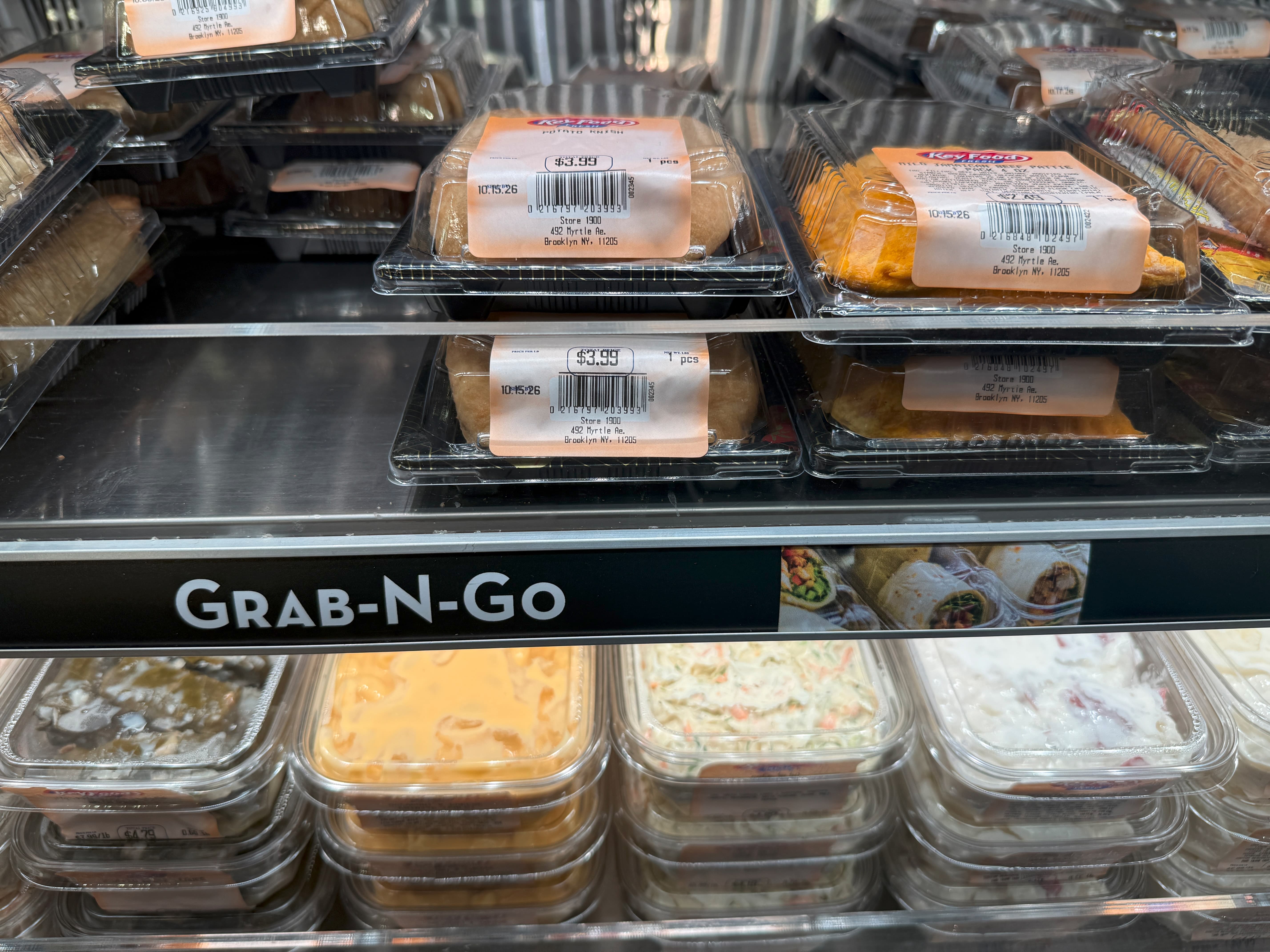
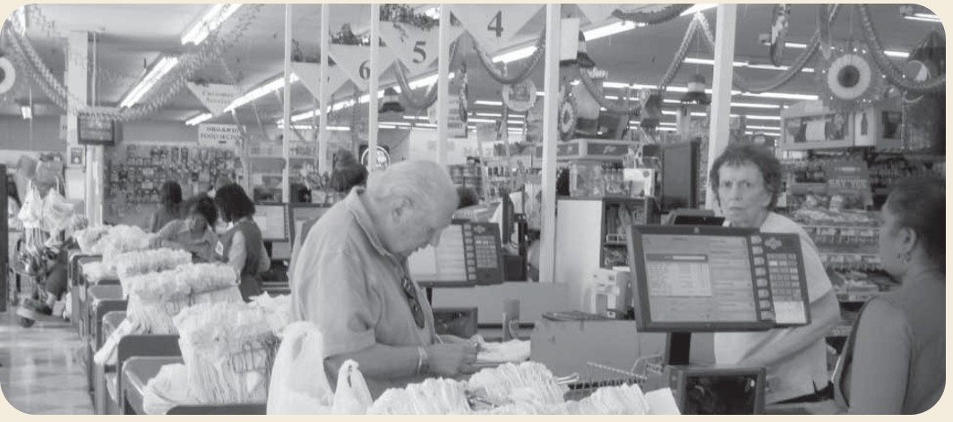
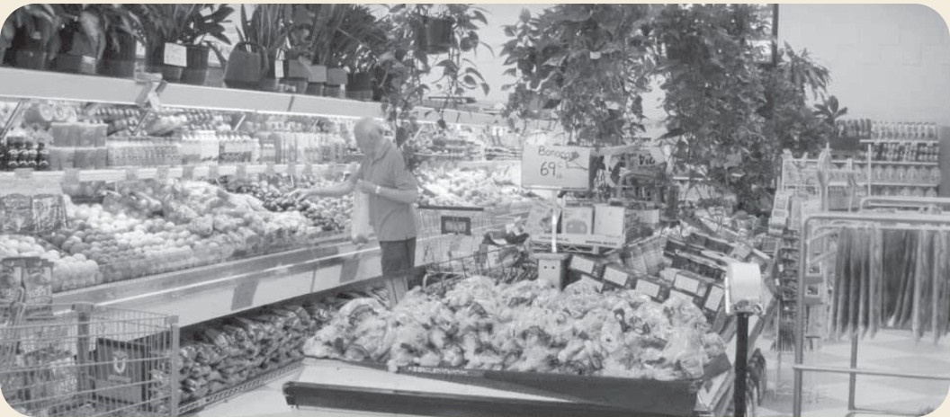
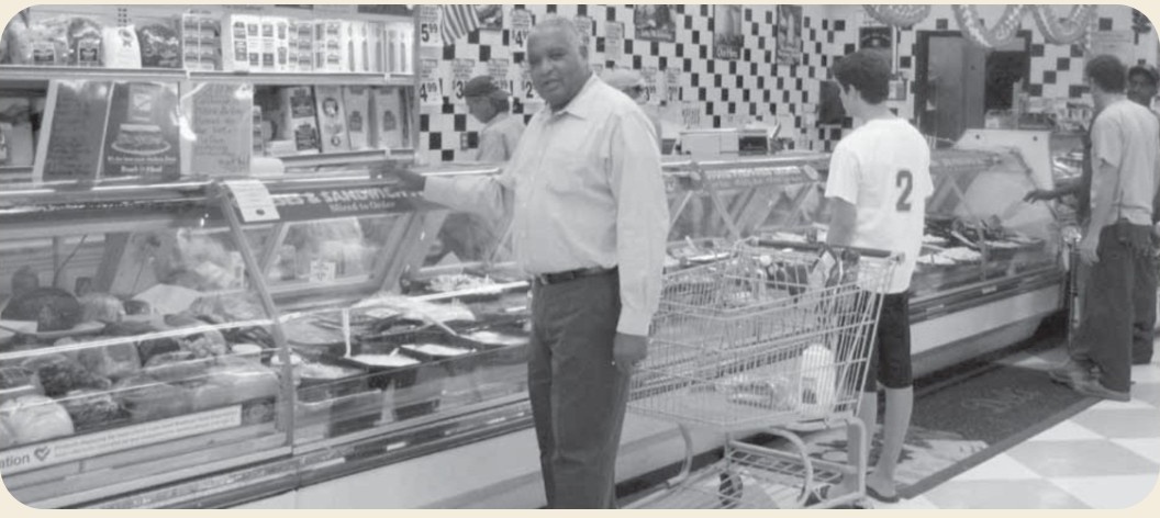
I began with a field audit of the Key Food at 490–492 Myrtle Avenue, photographing every sign, label, and price tag.
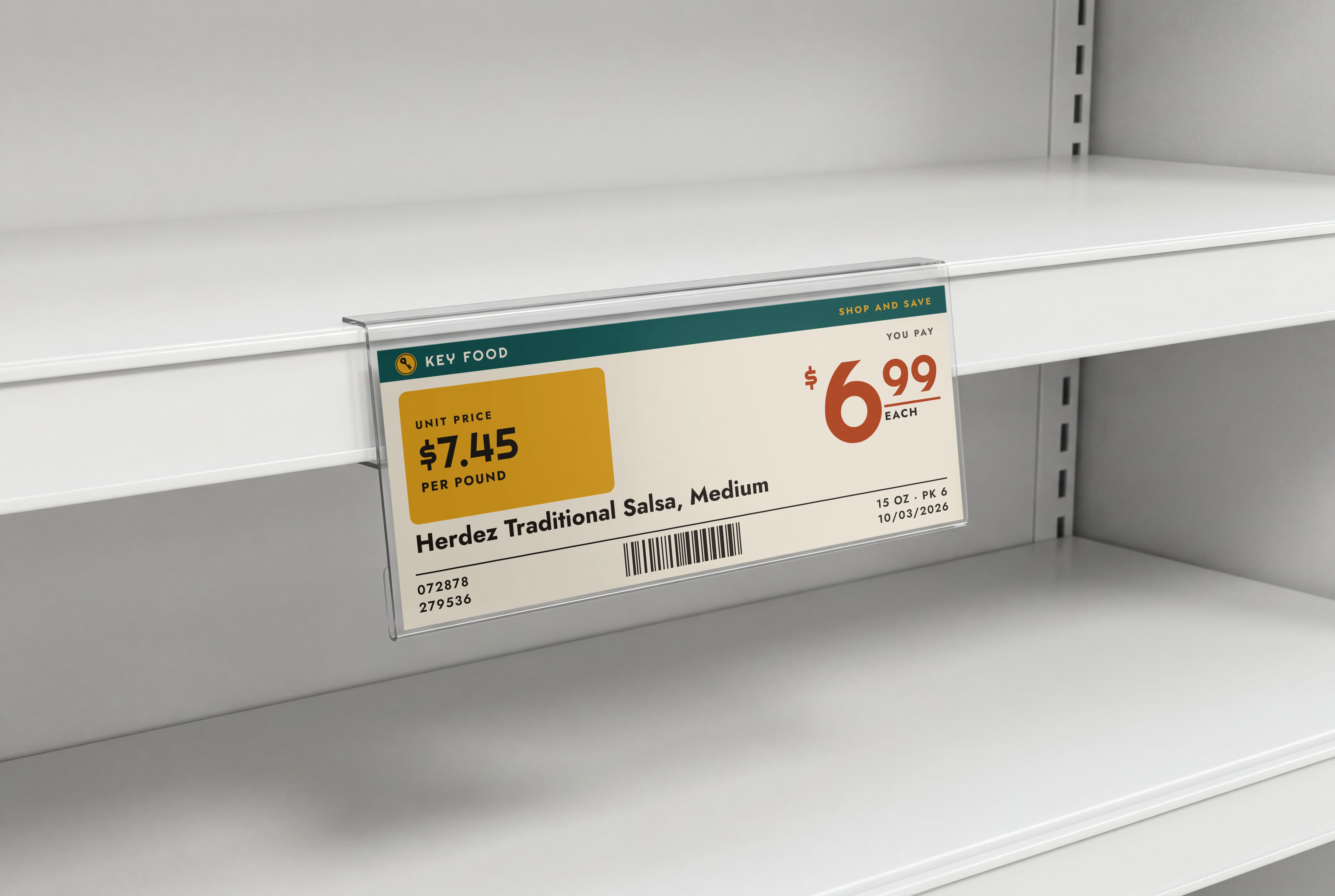
The outside sign was bland and the logo dated. Window graphics, weekly specials, and prepared-food labels all spoke differently, manager specials were handmade, and shelf prices were hard to read from an angle on the concave shelves. The store had plenty of signs but no system.
The logo
Two old logos, one new system
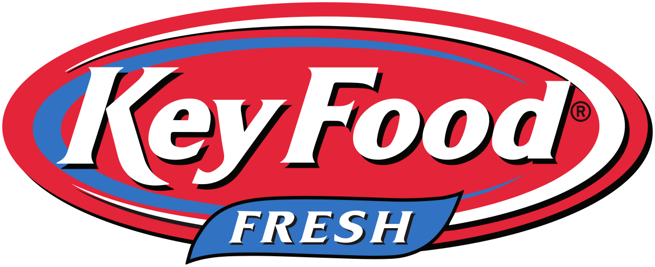
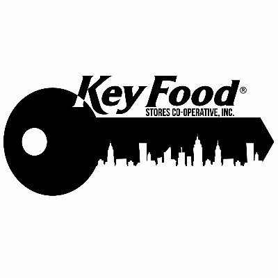
Key Food uses two logos today: the red Key Food Fresh oval and an older skyline key. Neither works as a system, so the rebrand replaces both with a single key badge and a Righteous wordmark.
Before
After
The key doesn’t scale
The skyline key has too many small details. The building cutouts and thin teeth fill in and disappear at the sizes of a shelf tag, an app icon, or a sign across the store.
“Fresh” isn’t needed
Fresh is a tagline, not part of the name. Taking it off the logo lets the wordmark stand on its own and leaves room for the badge.
History
Where Key Food came from
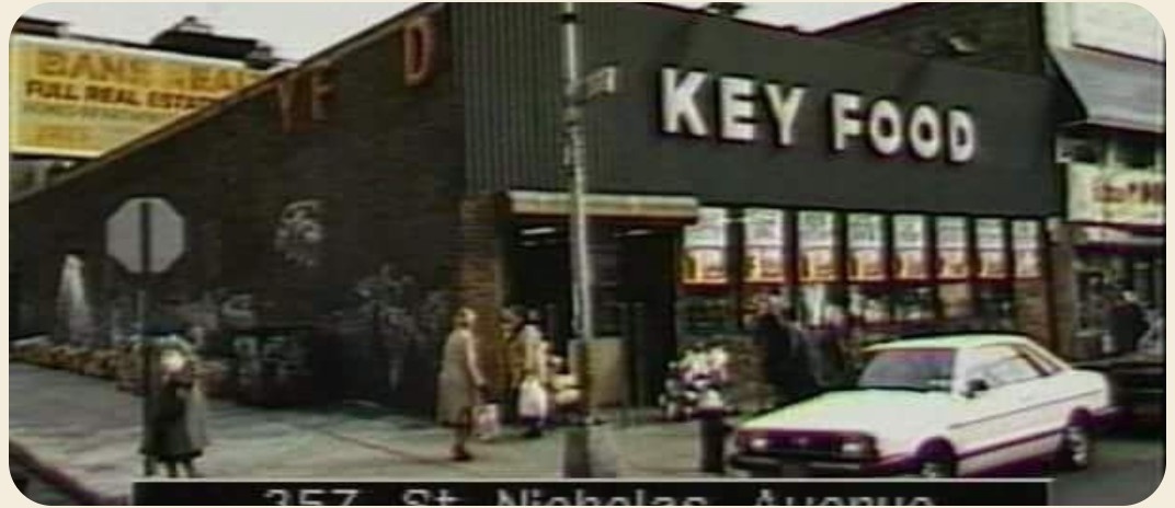
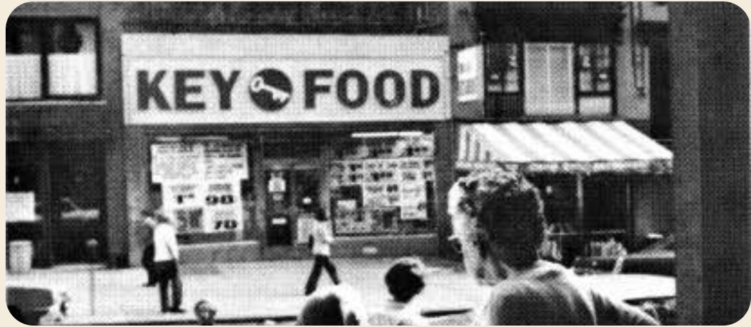
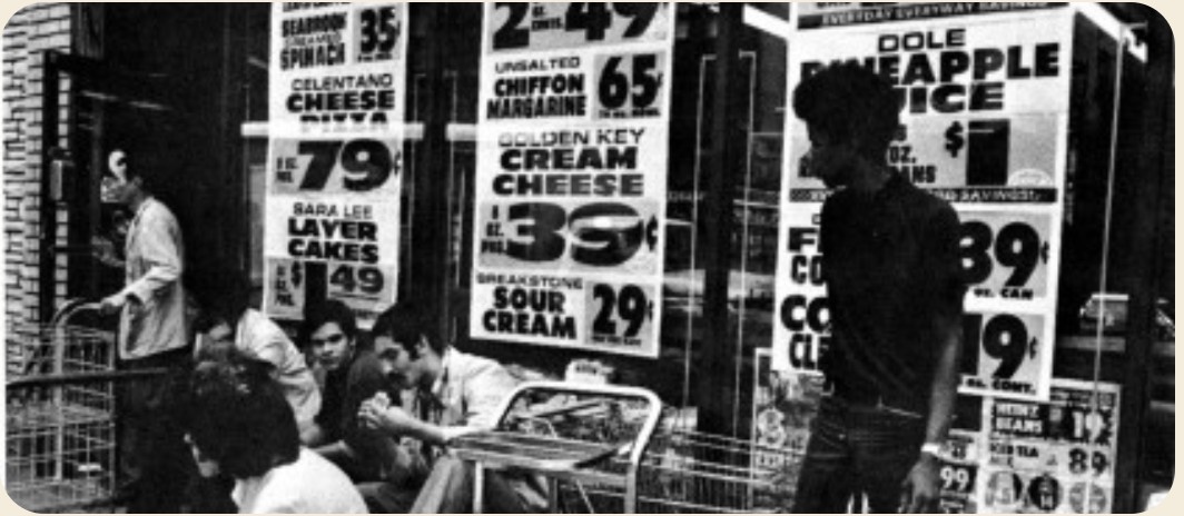
Archival photos of Key Food stores showed a brand that once had real character: bold rooftop signs, hand-lettered window specials, and busy neighborhood aisles. That history became the starting point for the rebrand.
Why mid-century modern
Born in the aisle
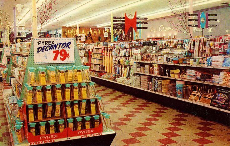
The postwar supermarket is where the style of the grocery store was invented.
Built for systems
Color-coded aisles, huge numerals, and flat color scale to every sign and screen.
Warm, not nostalgic
Cheerful pattern and color, used with restraint so it reads current.

Identity
Building the badge
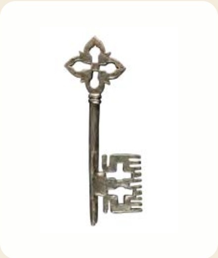
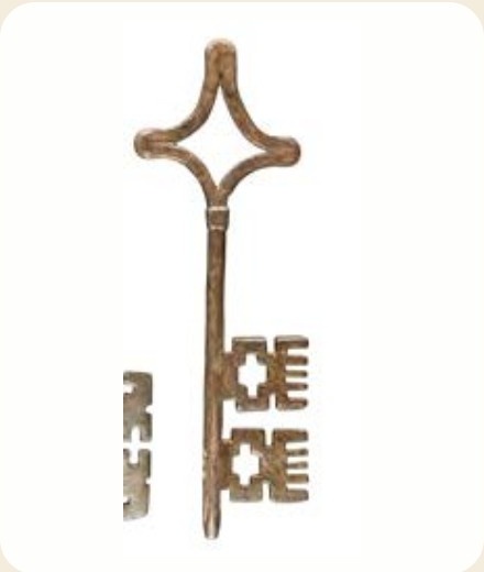
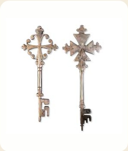
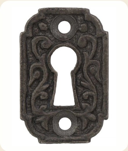
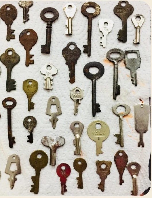
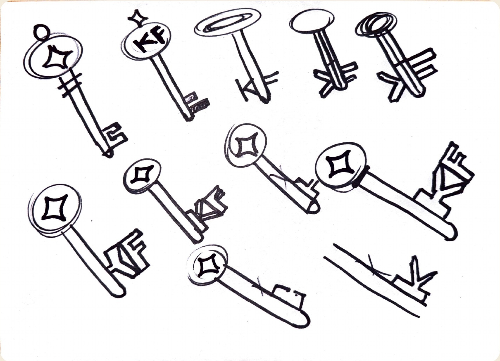
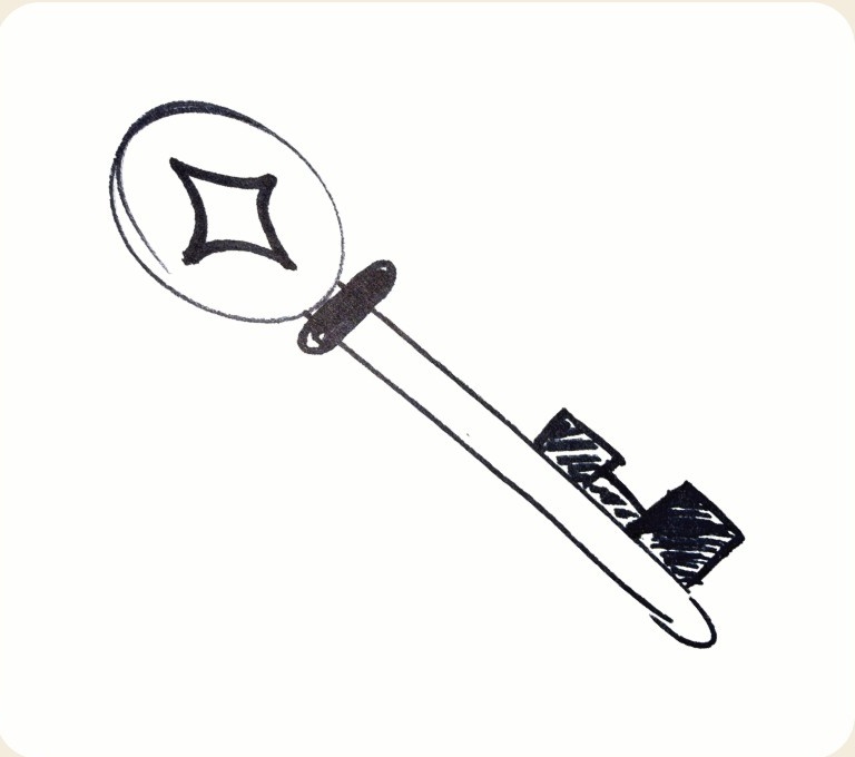
I collected 20th-century keys, sketched round bows and stepped bits, then distilled them into one mark: a key tilted on the diagonal inside a ringed badge.

Badge and wordmark
The badge works in full color, on teal, in one color, and reversed. The wordmark is set in Righteous with the O drawn as a keyhole or starburst for special moments.
Color and type
Market Teal, Mustard, Tomato, Cream, and Ink, with Righteous for the wordmark and prices, Jost for headlines and body, and one Yellowtail script line per layout.
Market Teal
#1F5C5A · Lead color
Mustard
#E3A82B · Badge, swashes
Tomato
#D0532B · Prices, script
Cream
#F4ECDC · Background
Ink
#2A2622 · Key, small type
Righteous
Wordmark, product names, prices
Jost
Headlines, body, labels
Yellowtail
One script line per layout
Icon family
Sixteen icons in one ring, plus seasonal Os. The rules: one color, solid shapes, circles and straight lines only, and everything fits inside the ring.
In the store
Department signs
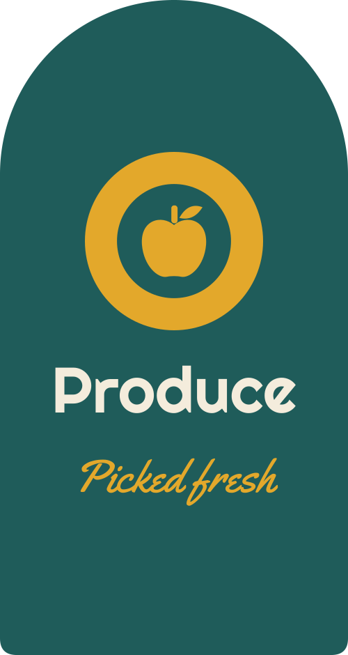
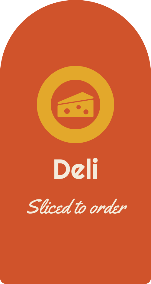
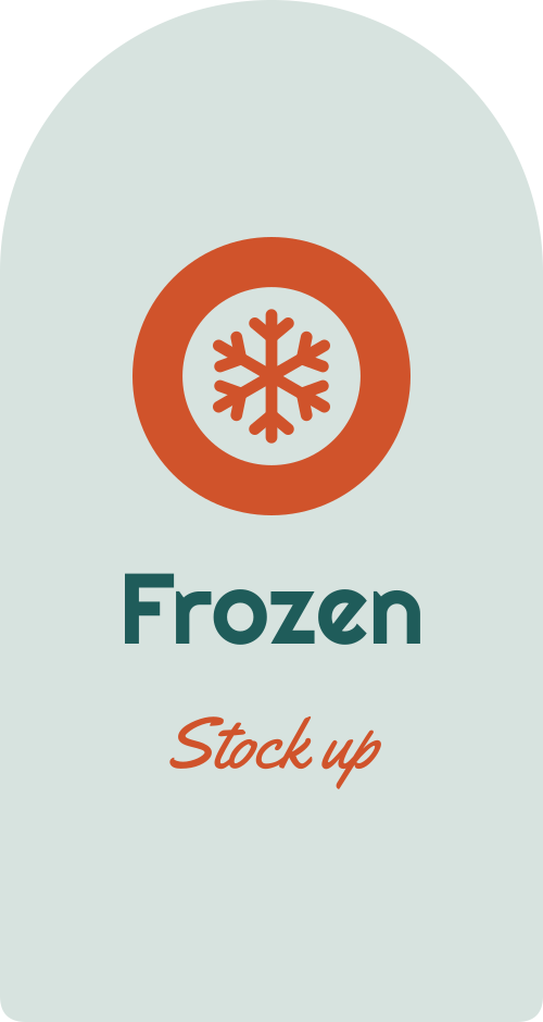
Each department gets a color, an icon, and a script line, like the color-coded aisle directories of the 1950s, so you can spot your section before you can read the word.


Promotions, painted by hand
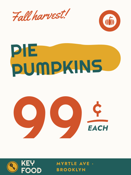
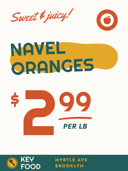
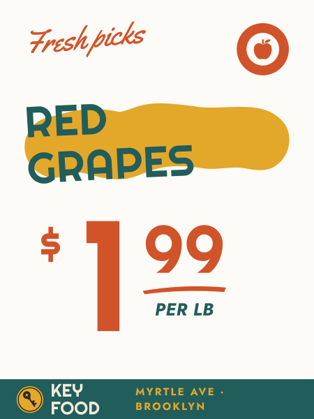
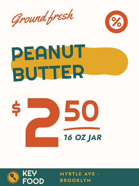
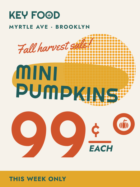
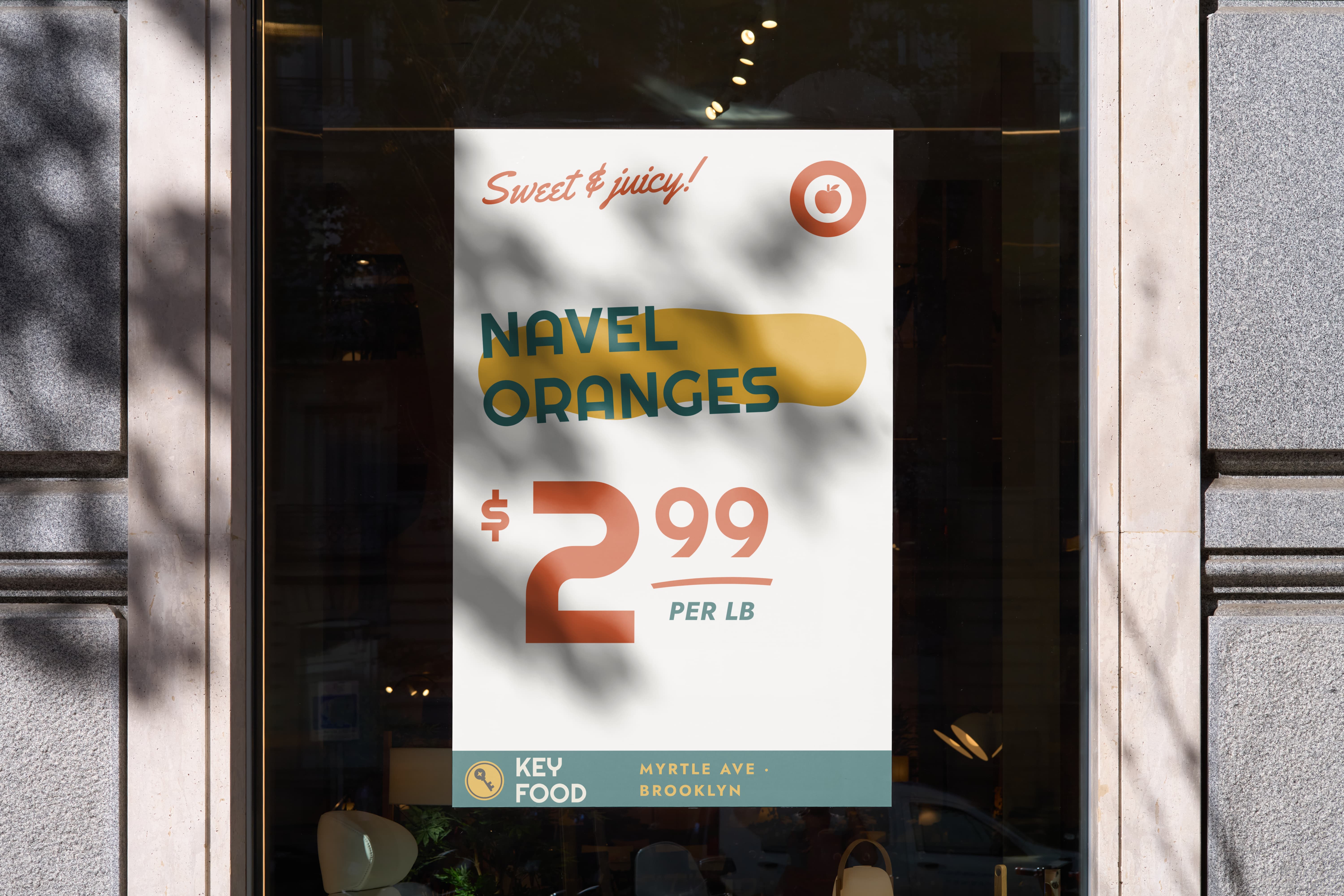
Every sign follows one recipe: a script kicker, the product over a mustard swash, a big tomato price with underlined cents, the department icon in the corner, and the store’s teal footer.
Inspired by NYC sign painting, they replace the handmade manager specials with something just as warm but readable from down the aisle.
Special editions
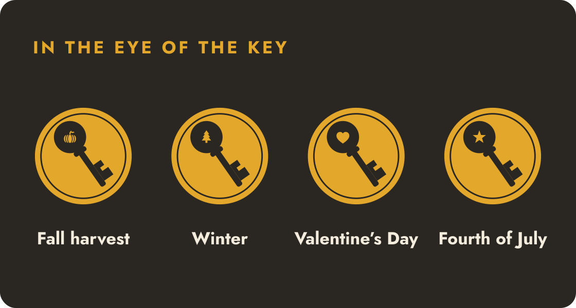
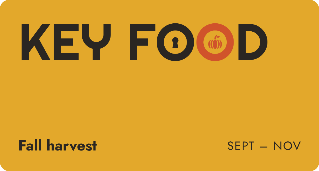
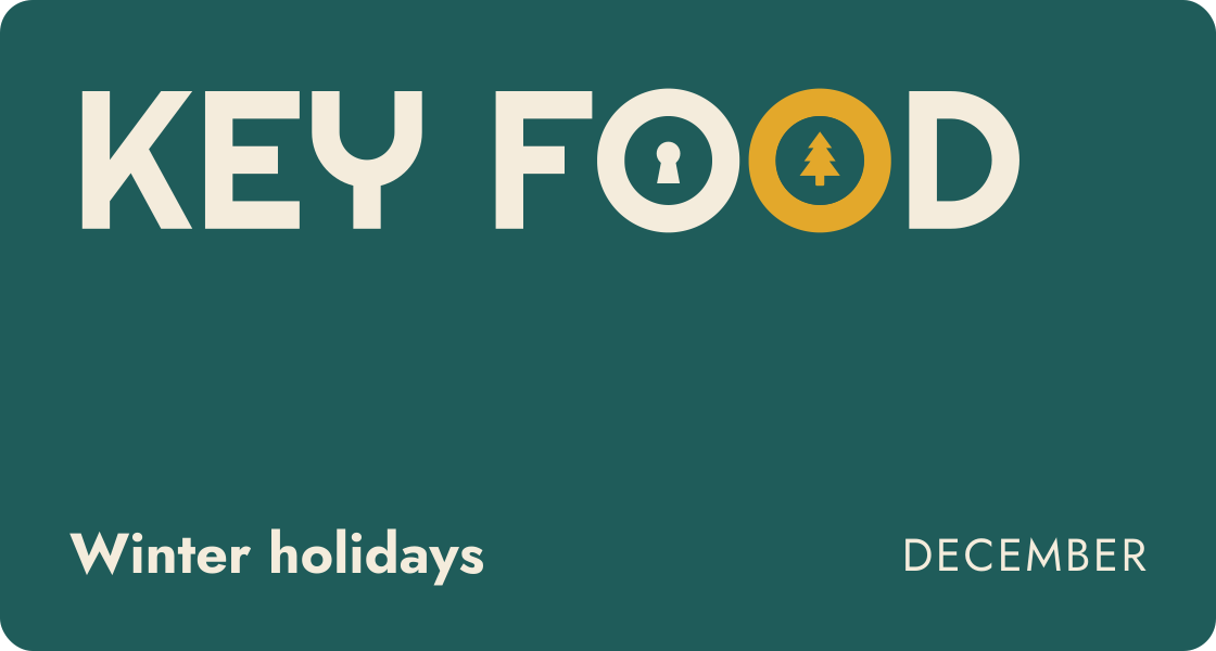
The keyhole stays; the starburst O swaps in for the moment, and the Os turn two-tone for seasons and sales.
Store brand
Urban Meadow, rebuilt
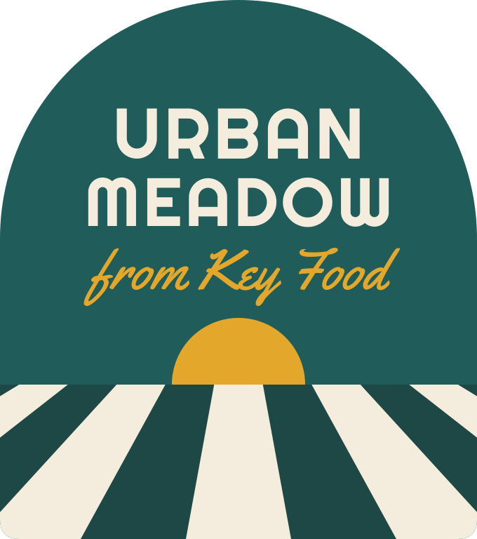
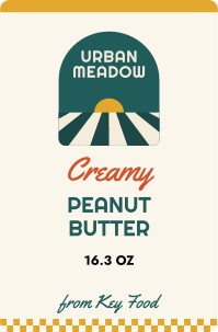
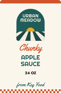
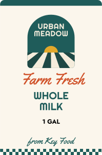
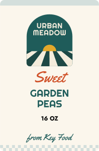
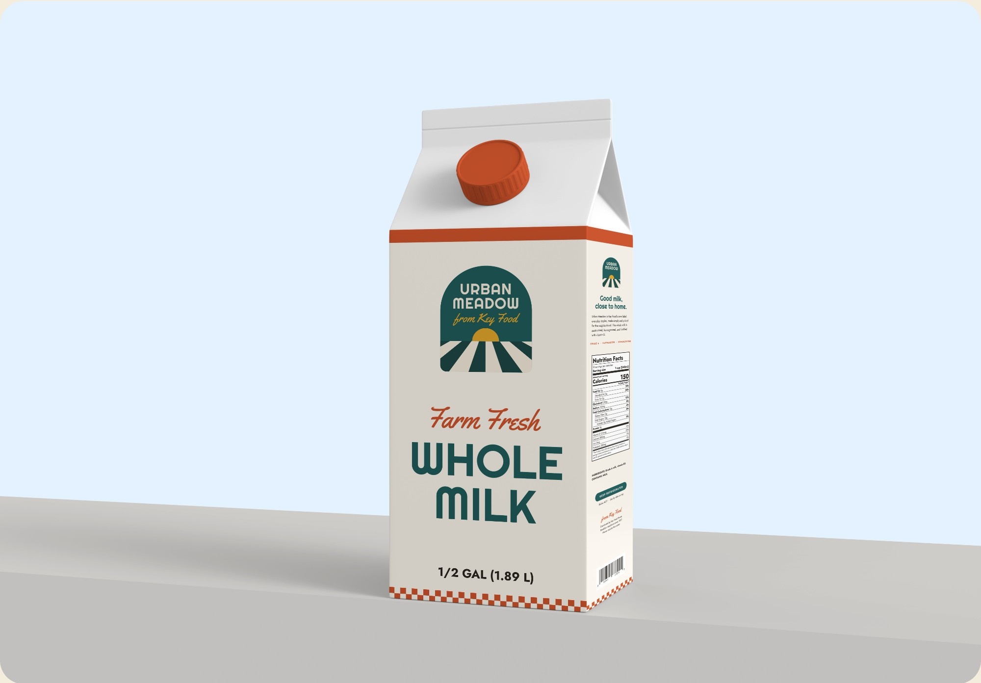
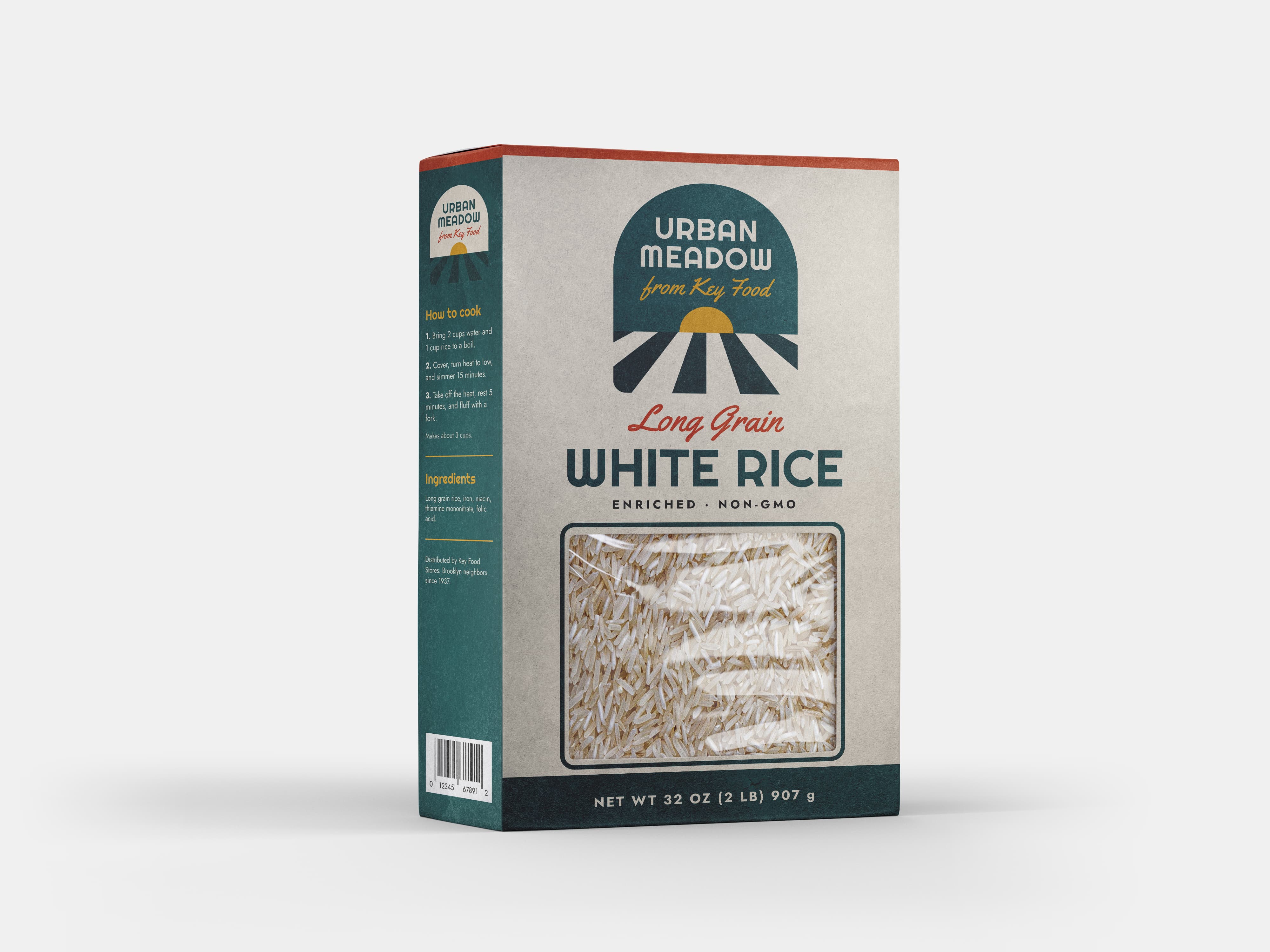
The old store brand was a black shield that could belong to any store. The new one keeps the meadow name but gets a sunrise over furrowed fields, borrows the system’s arch, palette, and script, and is signed “from Key Food”.
Applications
Out in the neighborhood
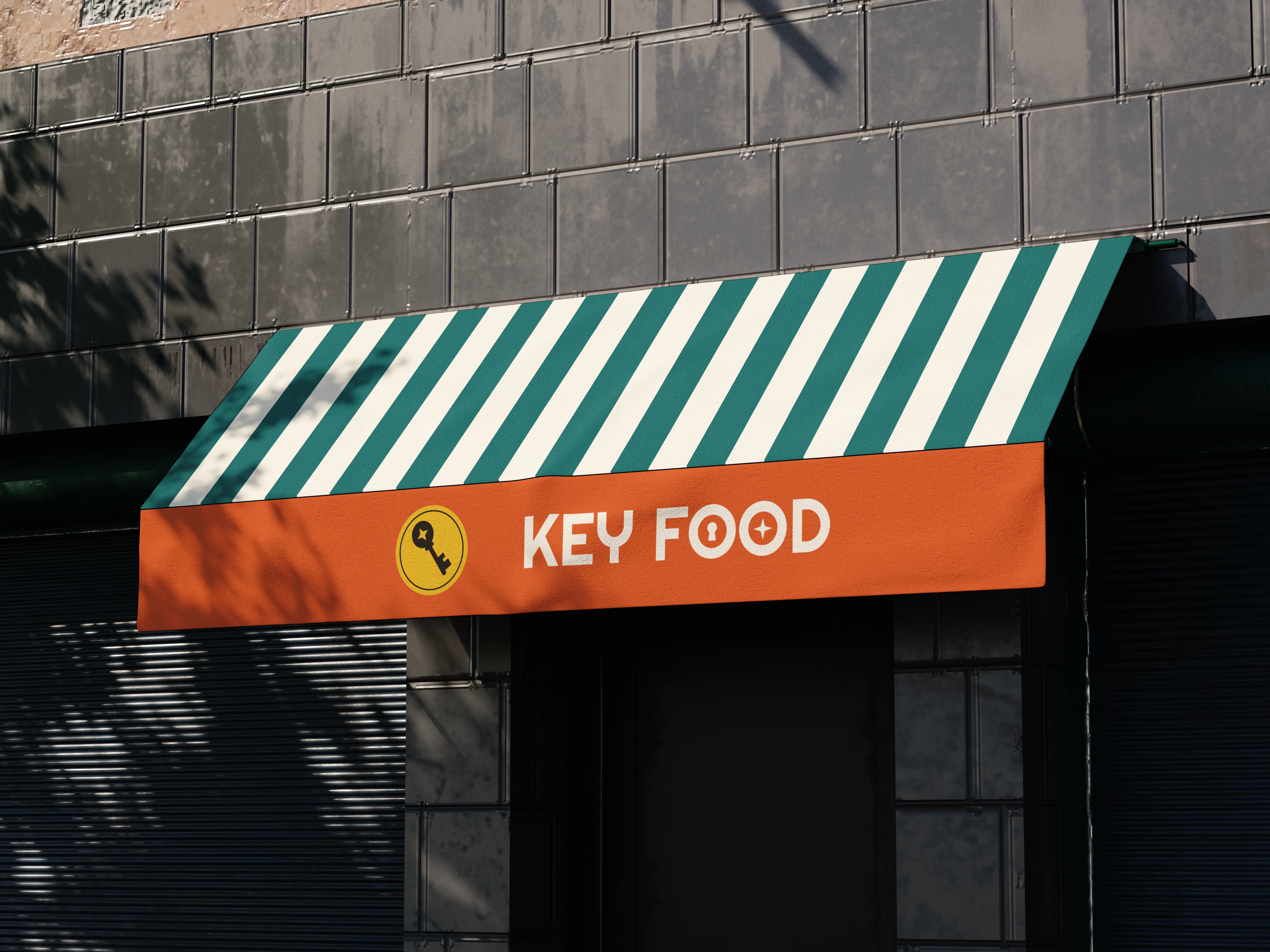
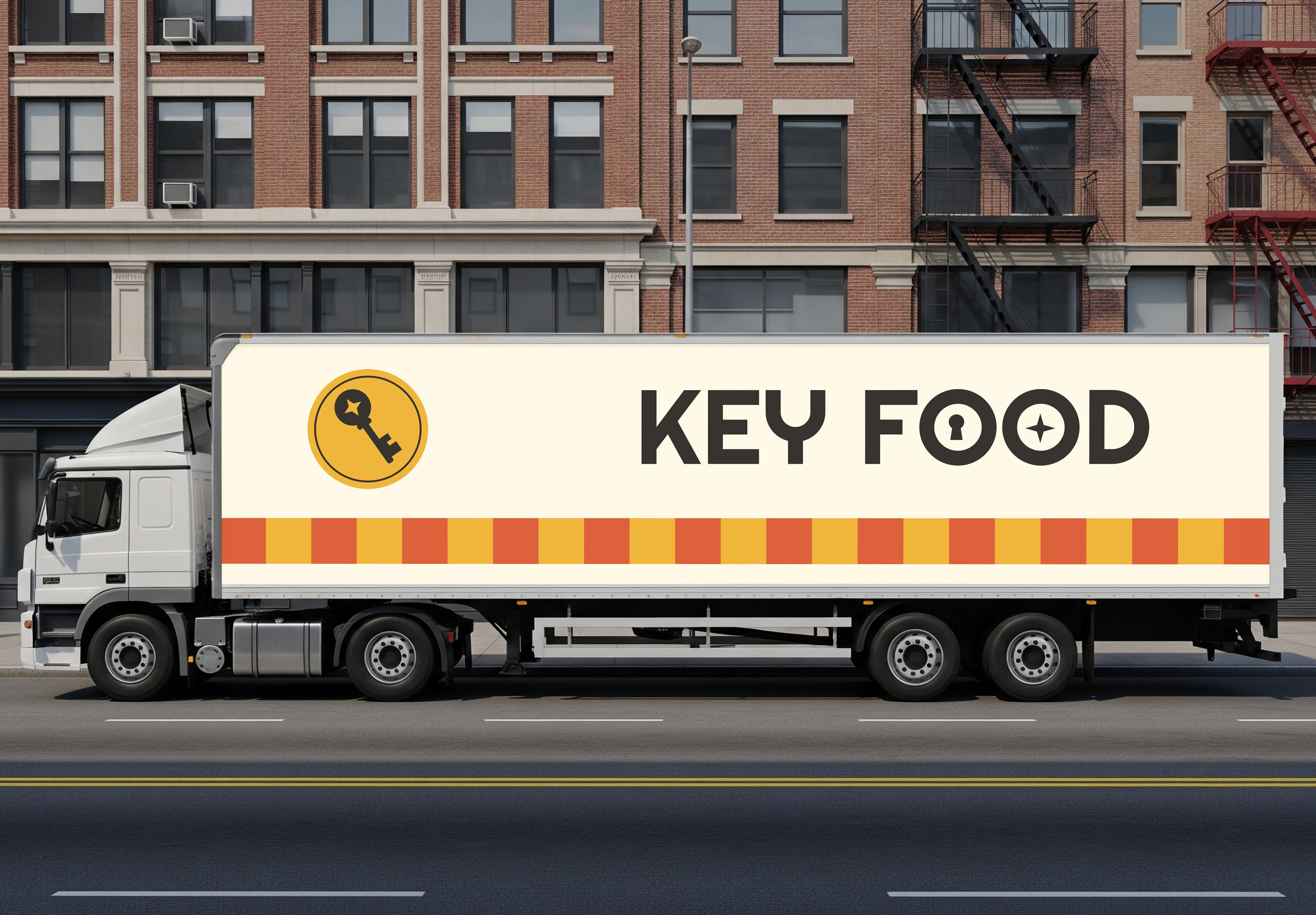
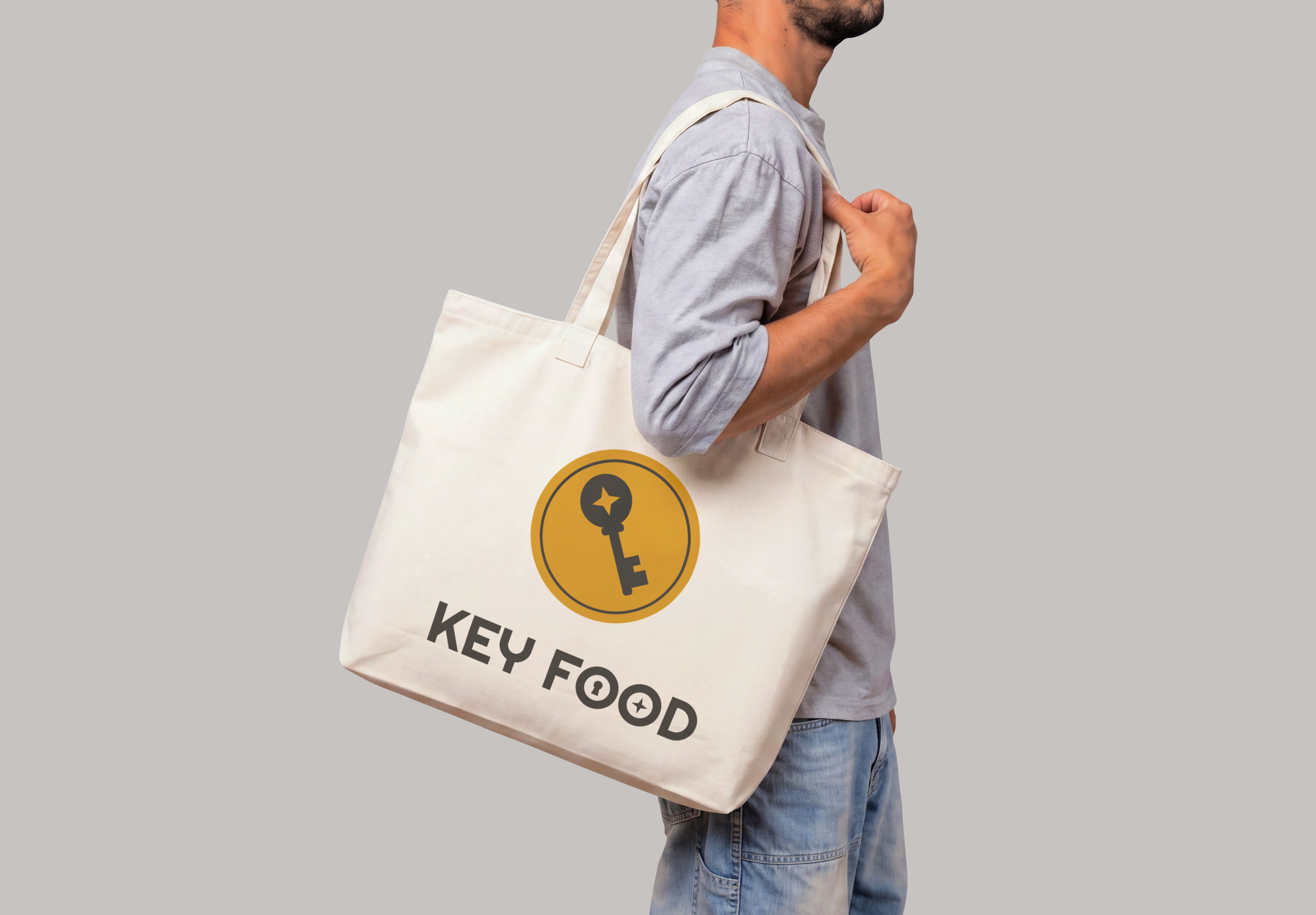
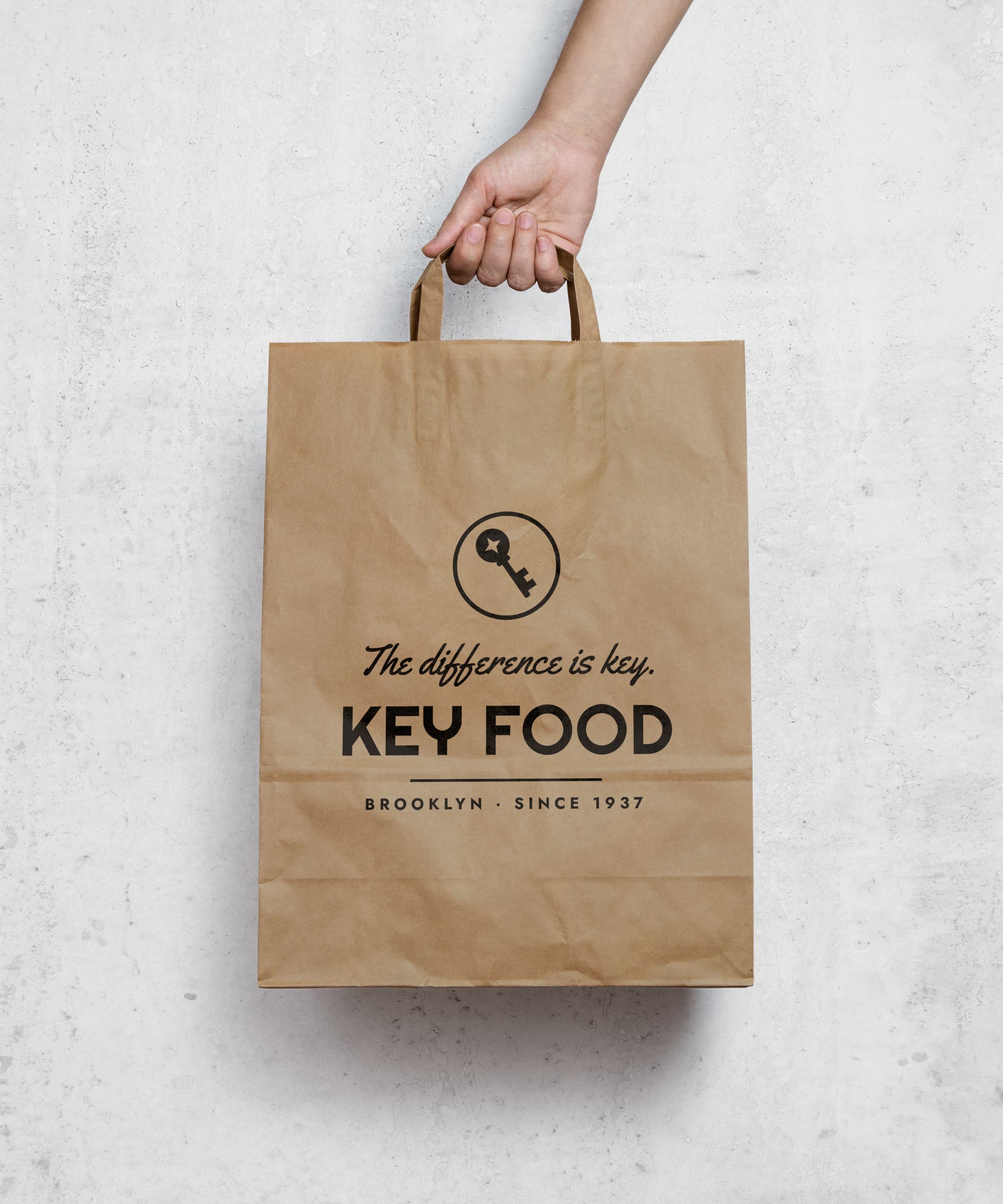
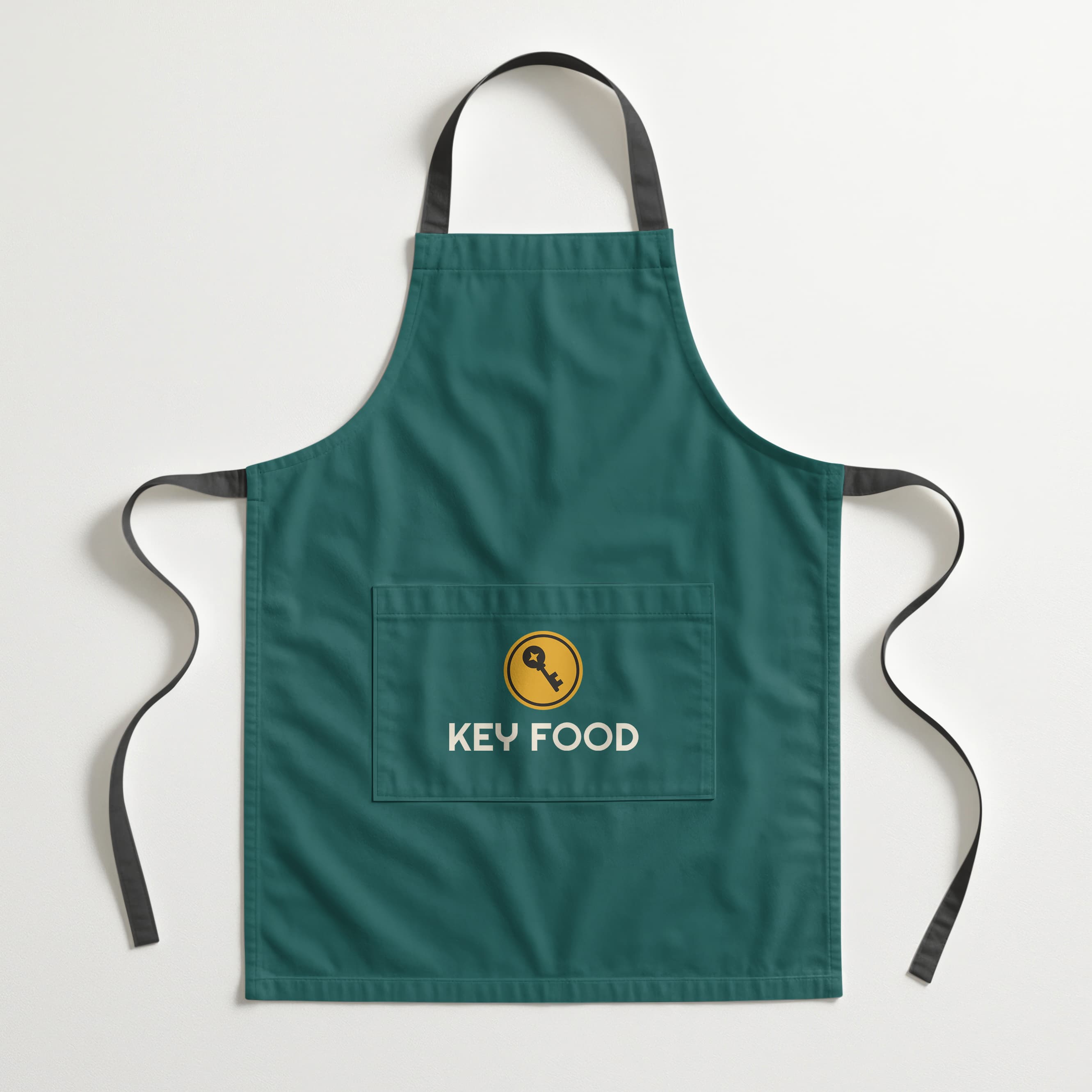
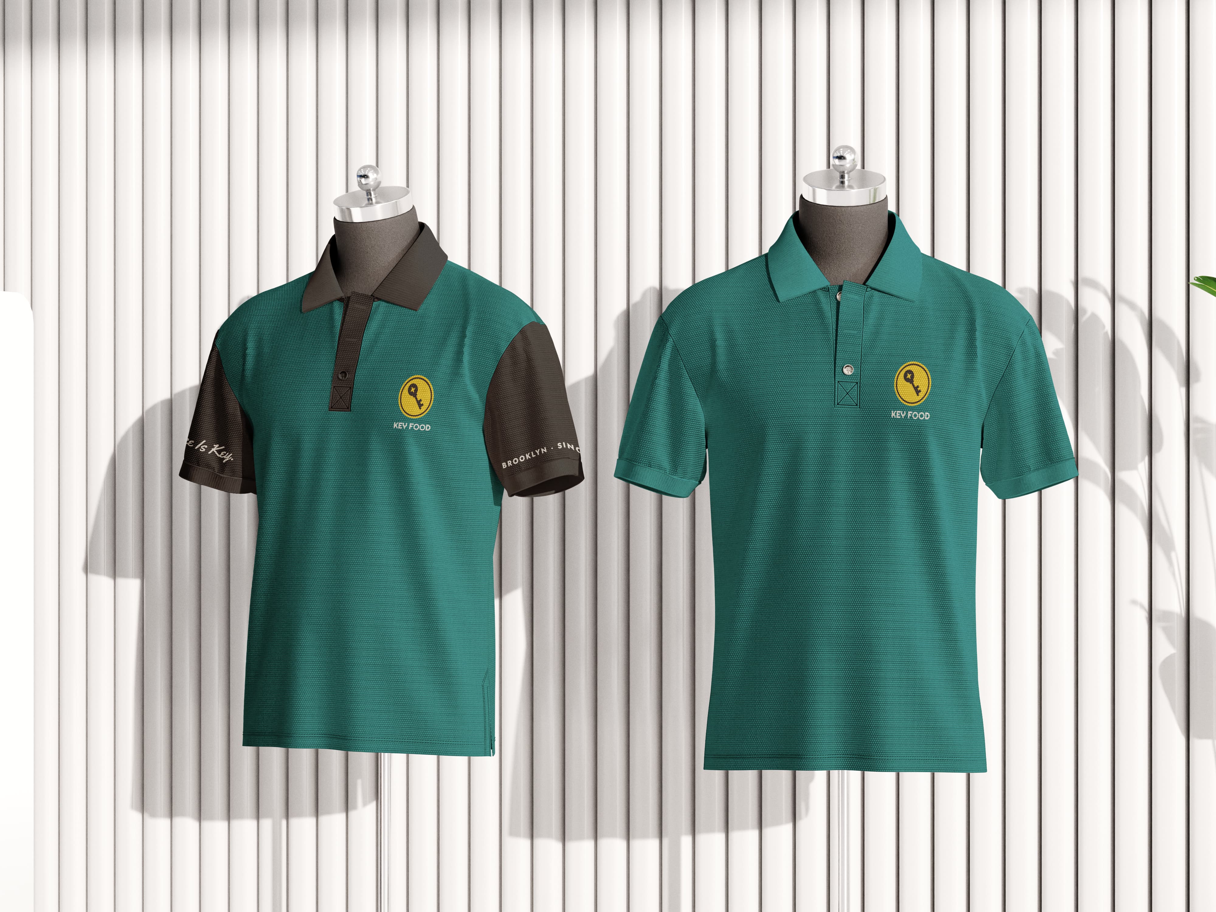
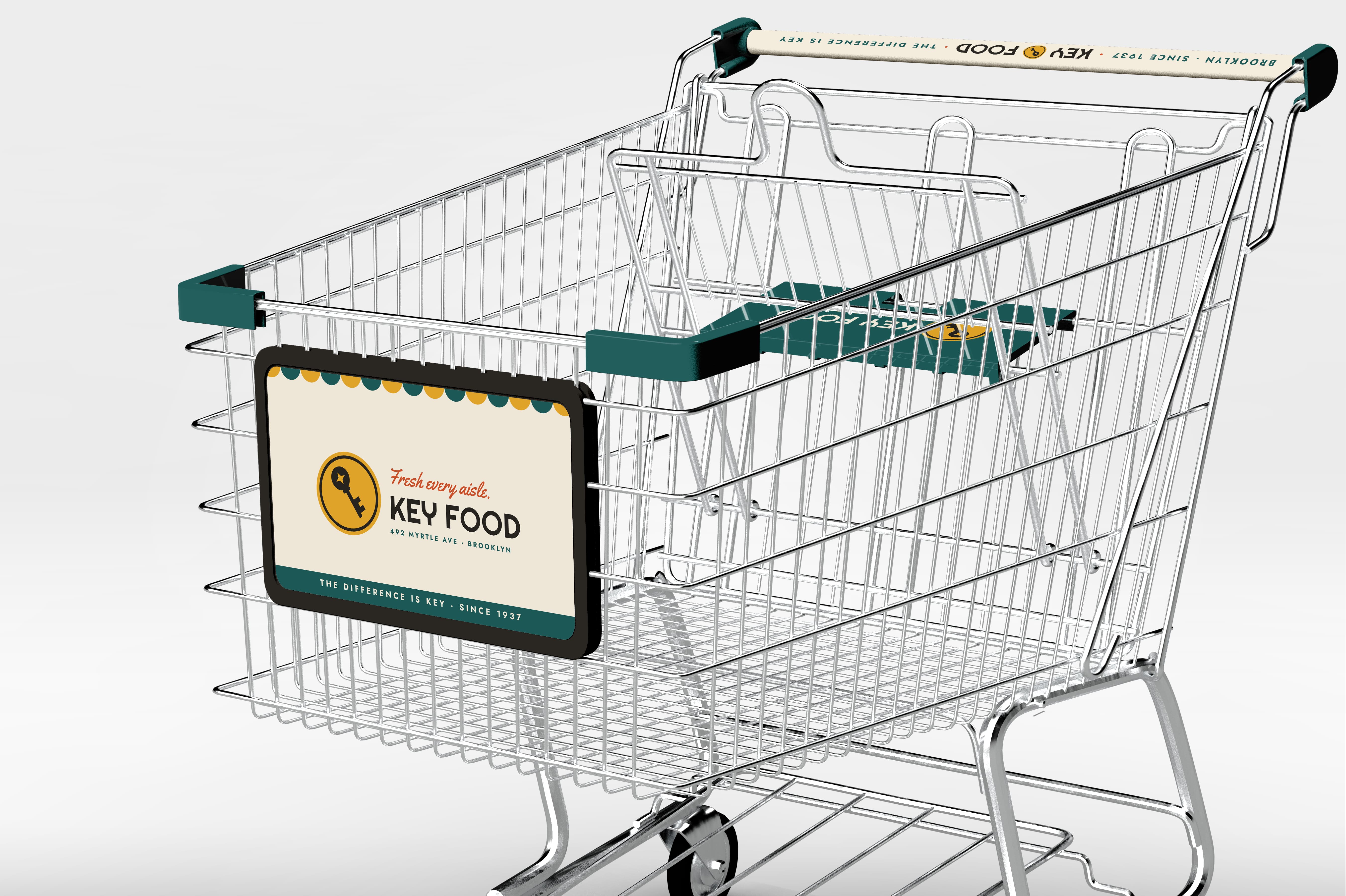
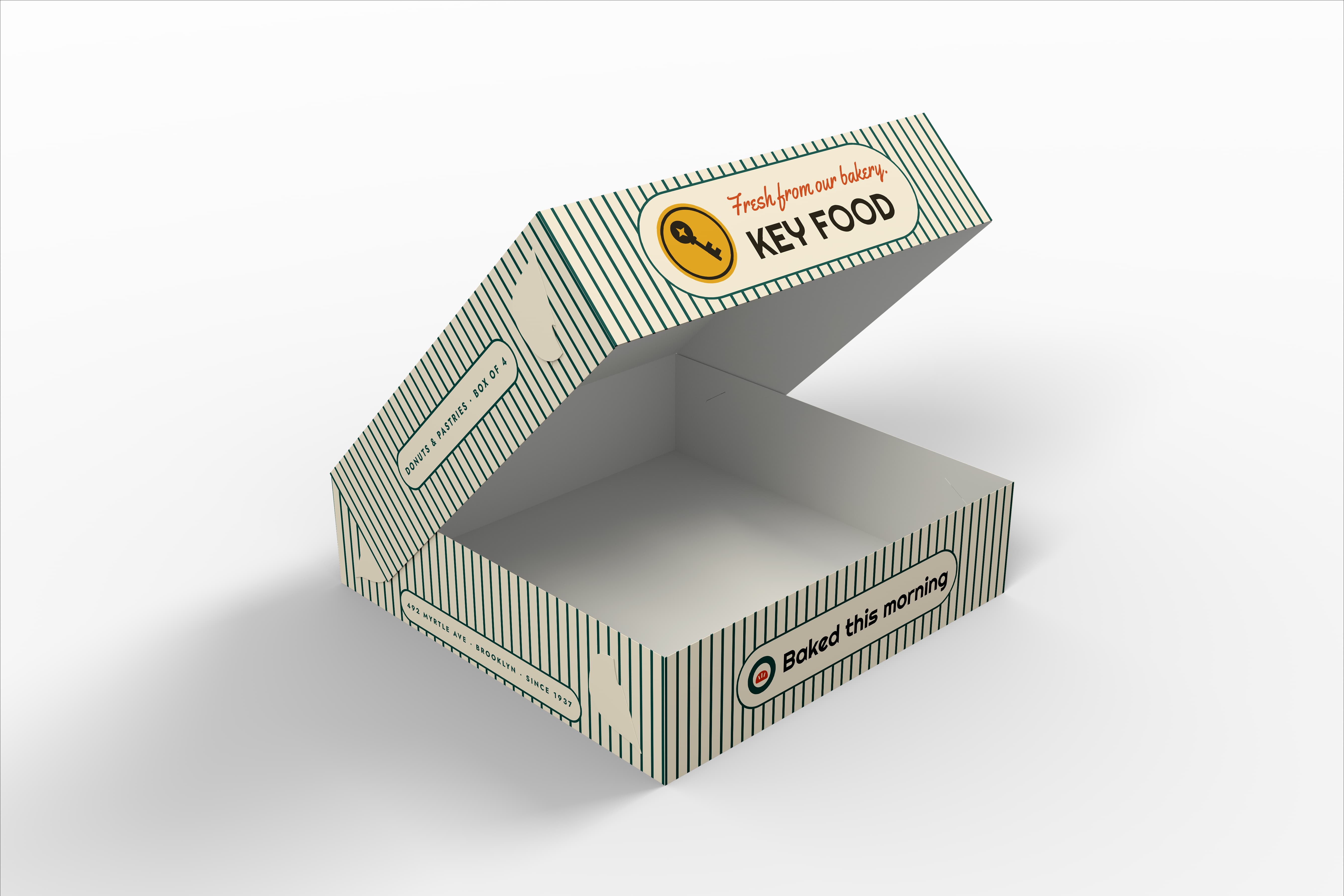
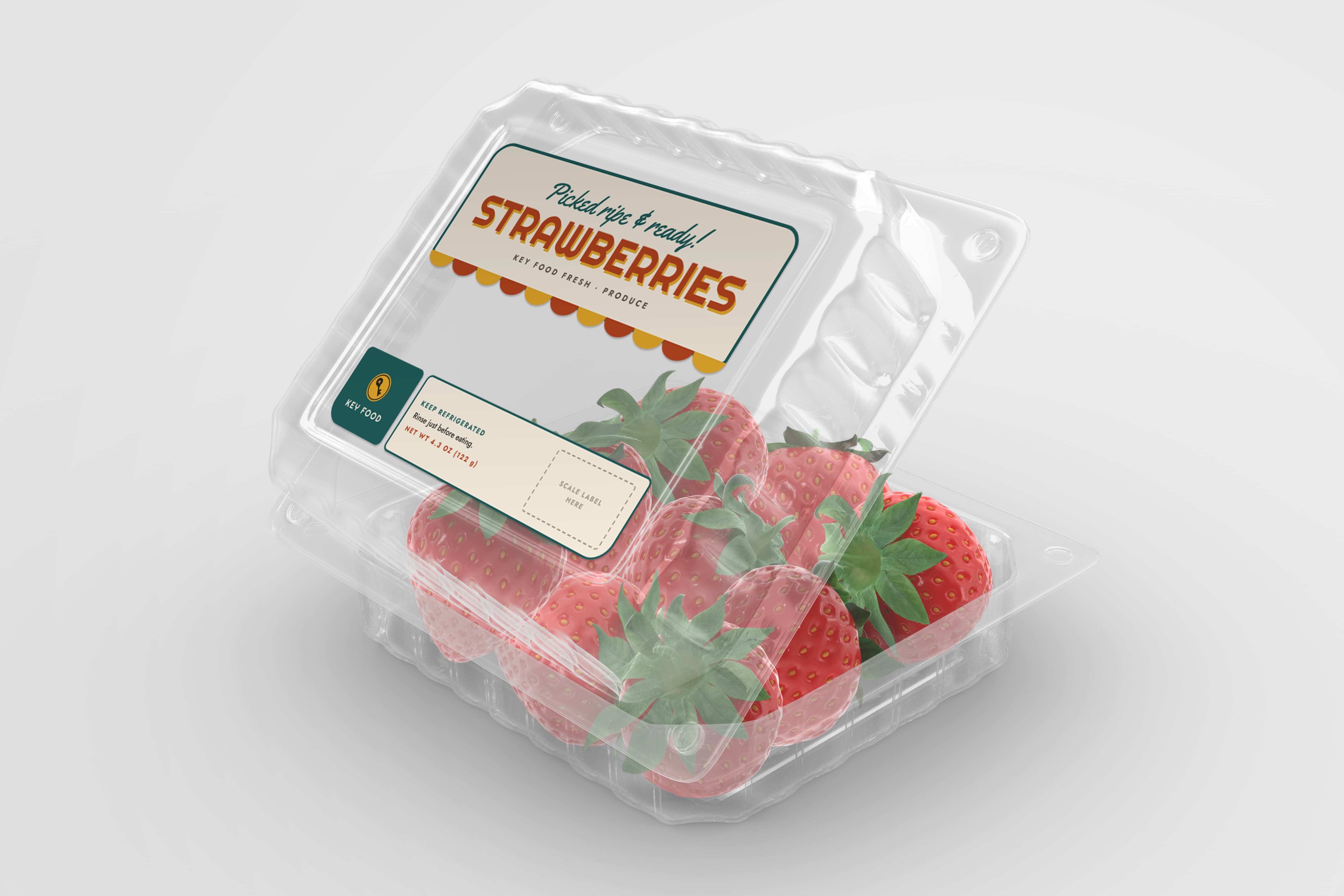
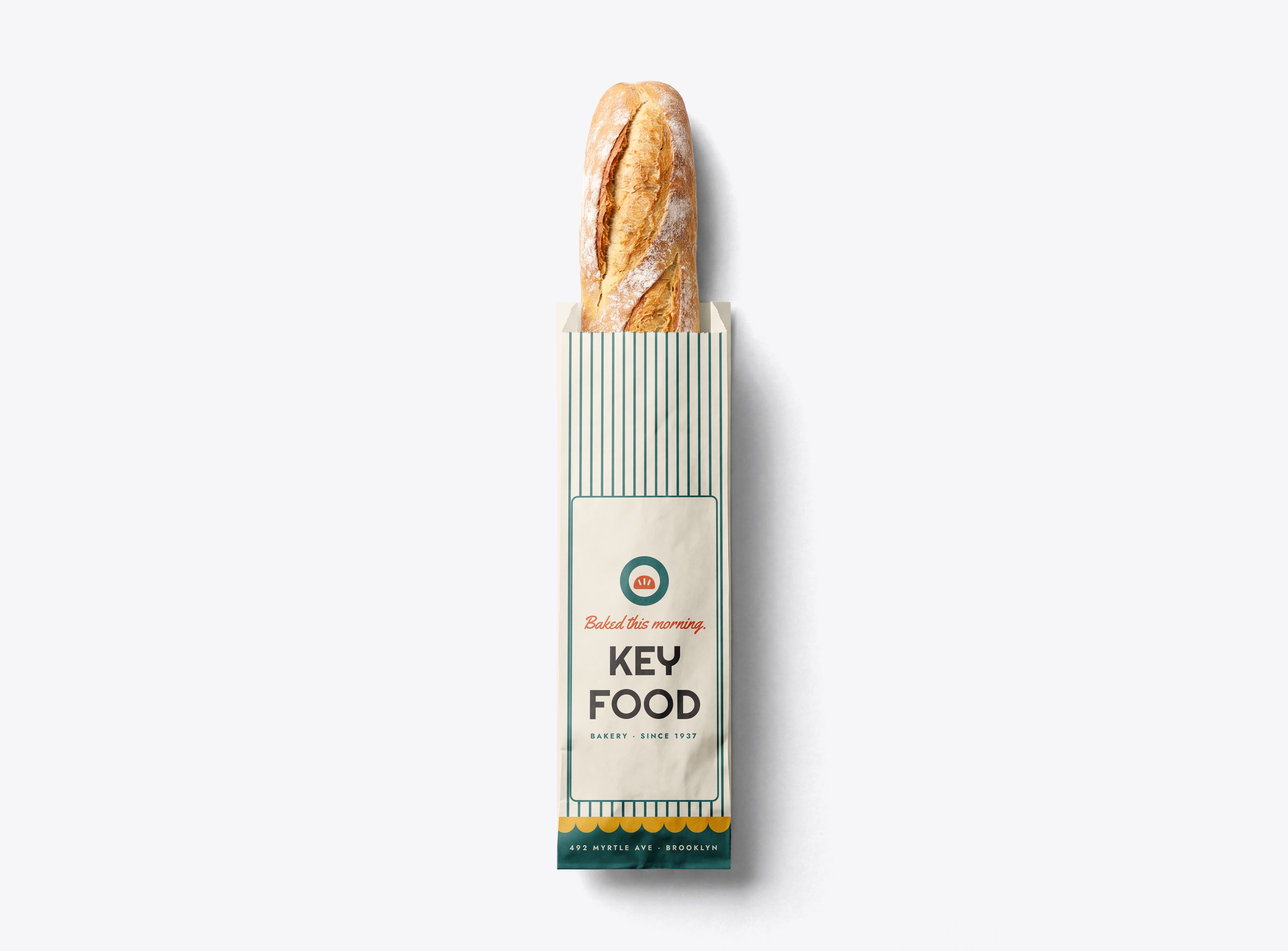
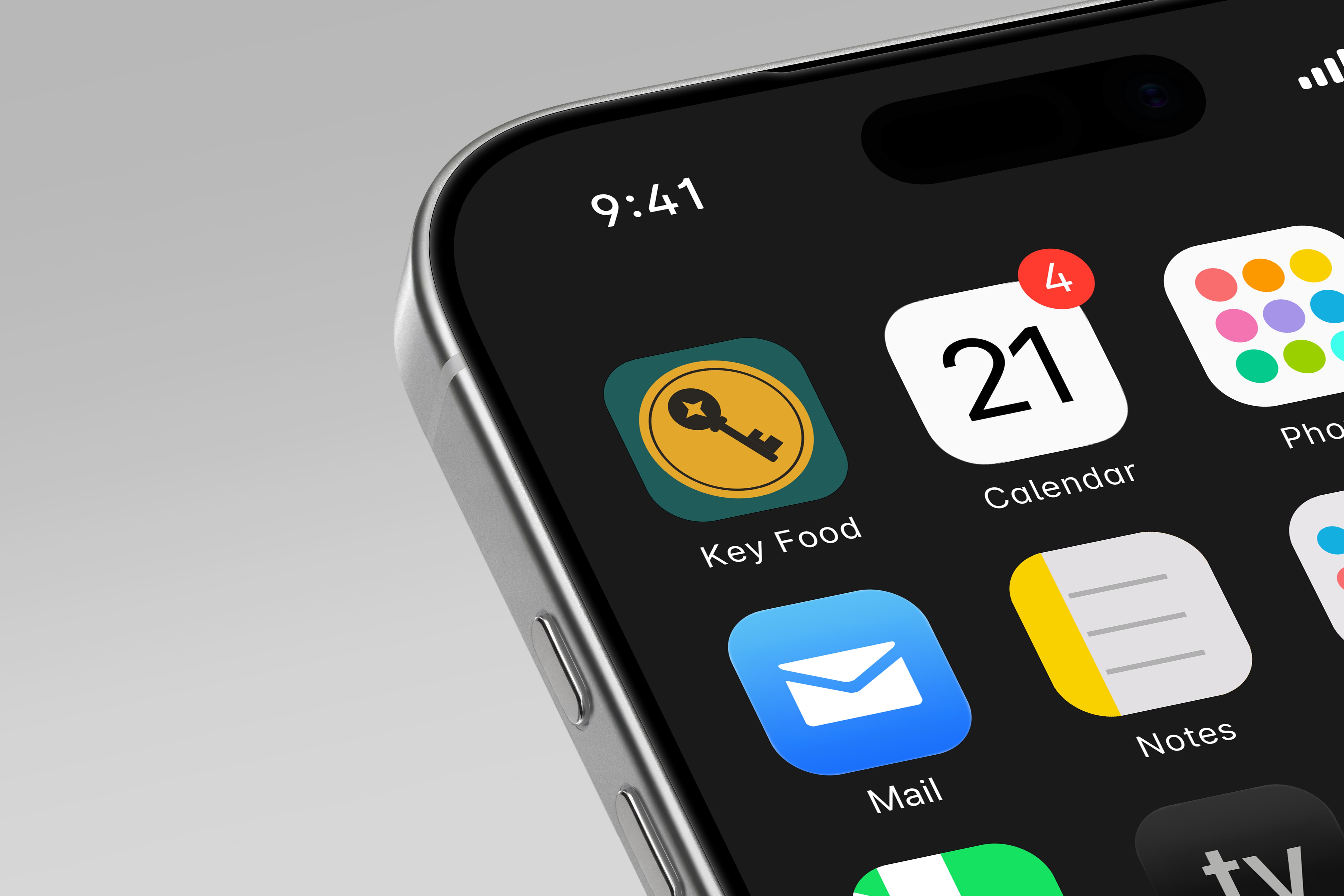
One badge, from the awning to the delivery truck to the app.